Problem
Users can find it difficult to find hobbies because they often find them. They do not know that there are many occupations.They may be able to live their lives and interests.
 Yana Diadchenko
Yandex Practicum student project
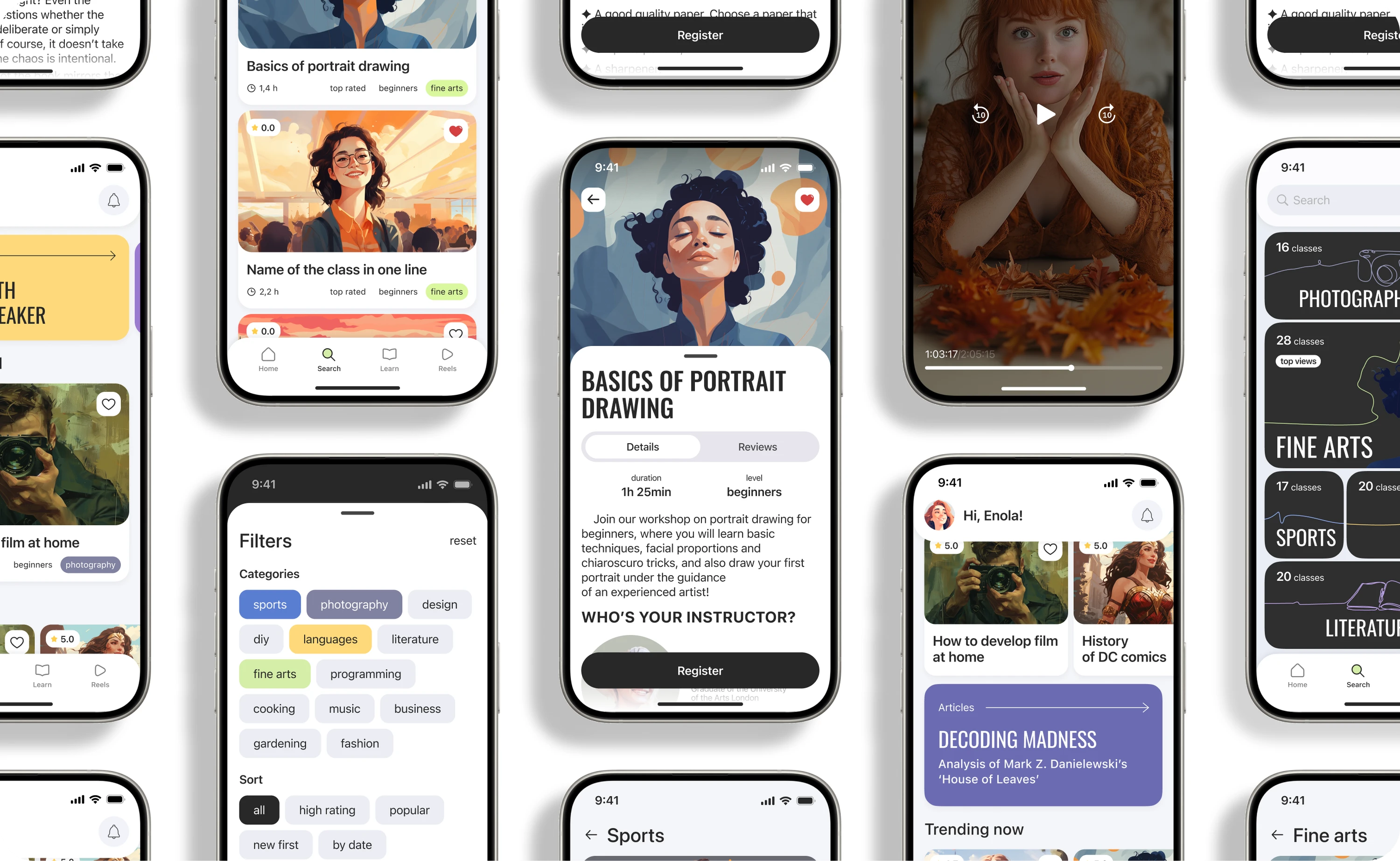
Users can find it difficult to find hobbies because they often find them. They do not know that there are many occupations.They may be able to live their lives and interests.
An application that helps to open up the world of various hobbies to users, find inspiration, try something new and discover amazing hobbies. The process of searching for a hobby should accessible, easy and interestingSo that everyone can find an activity that brings joy and satisfaction.
Research of the online education marketNetology shows that interest in him in recent years is systematically growing. By 2021, the share of people with online education experience has increased almost in the United States. 3 times (from 14.5% to 41.3%). Among the strongest trends is the popularization of mobile learning.
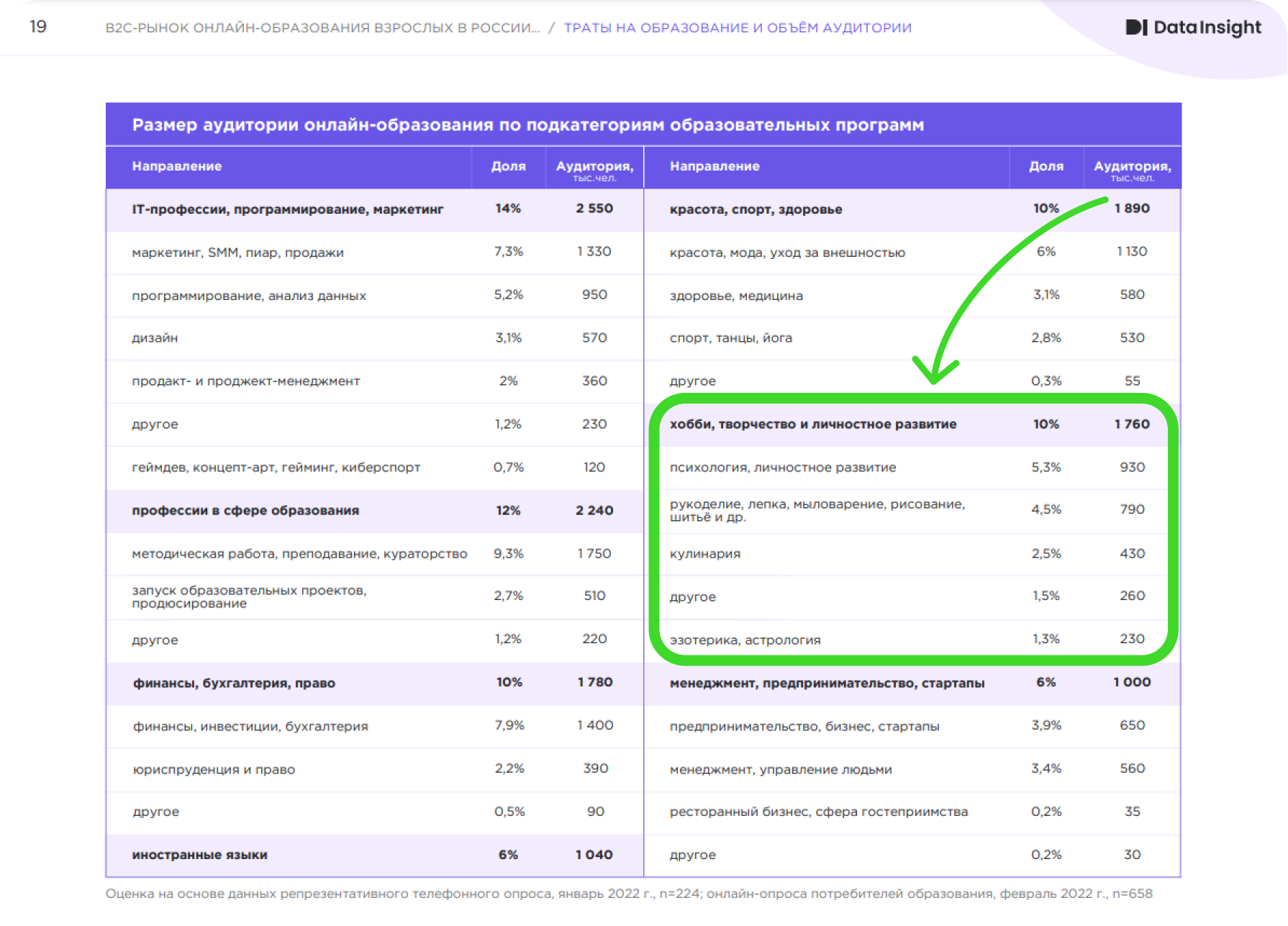
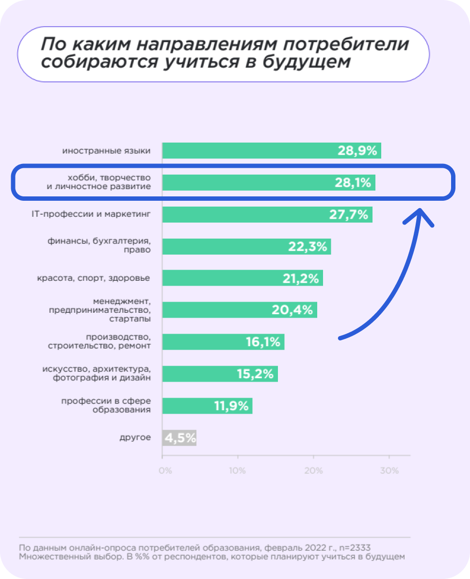
Among the problems with online education, respondents most often cited technical issues—36%. Lack of contact with an instructor —27%, and a lack of motivation to learn without instructor supervision—23%.

People of all ages who are looking for inspiration want to evolve and change their lives. From students craving new knowledge to professionals looking to delve deeper into their hobbies.
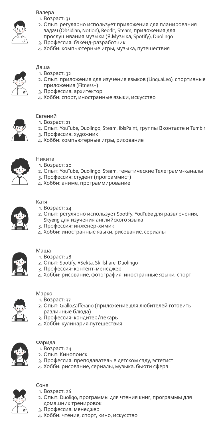
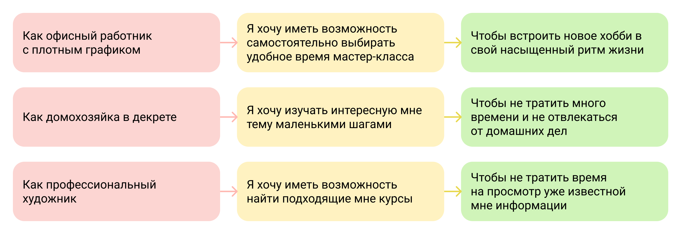
For convenience and understanding of the value of the product functions, I created 3 personas:

The team and I identified 8 competitors and shared them. The analysis was carried out on 3 main indicators:
Usability. Useful functions of competitors
Visual design. Good design solutions
Functionality. Advantages and Disadvantages of Nielsen Heuristics Competitors
We went through basic scenarios, identified patterns and useful mechanics, and noted the presence (or absence) of necessary features.
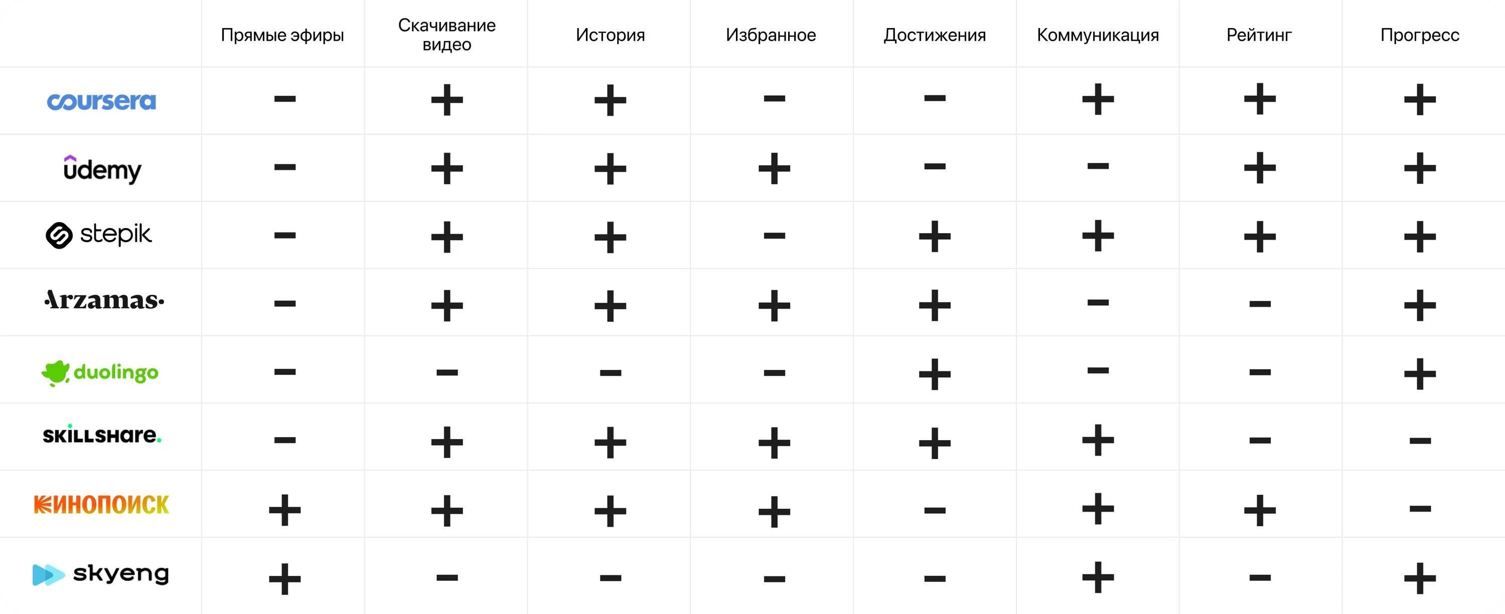
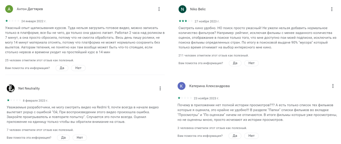
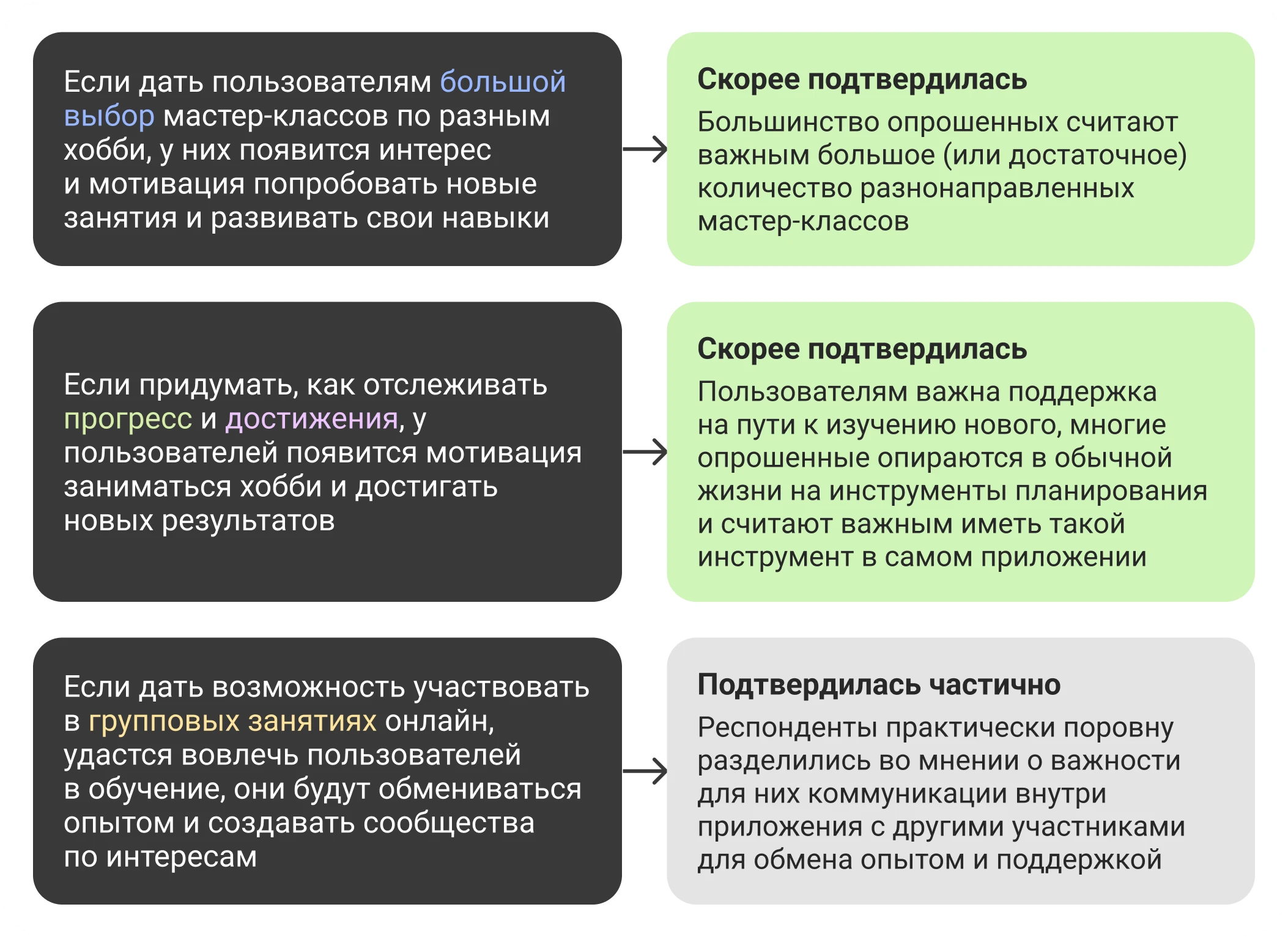
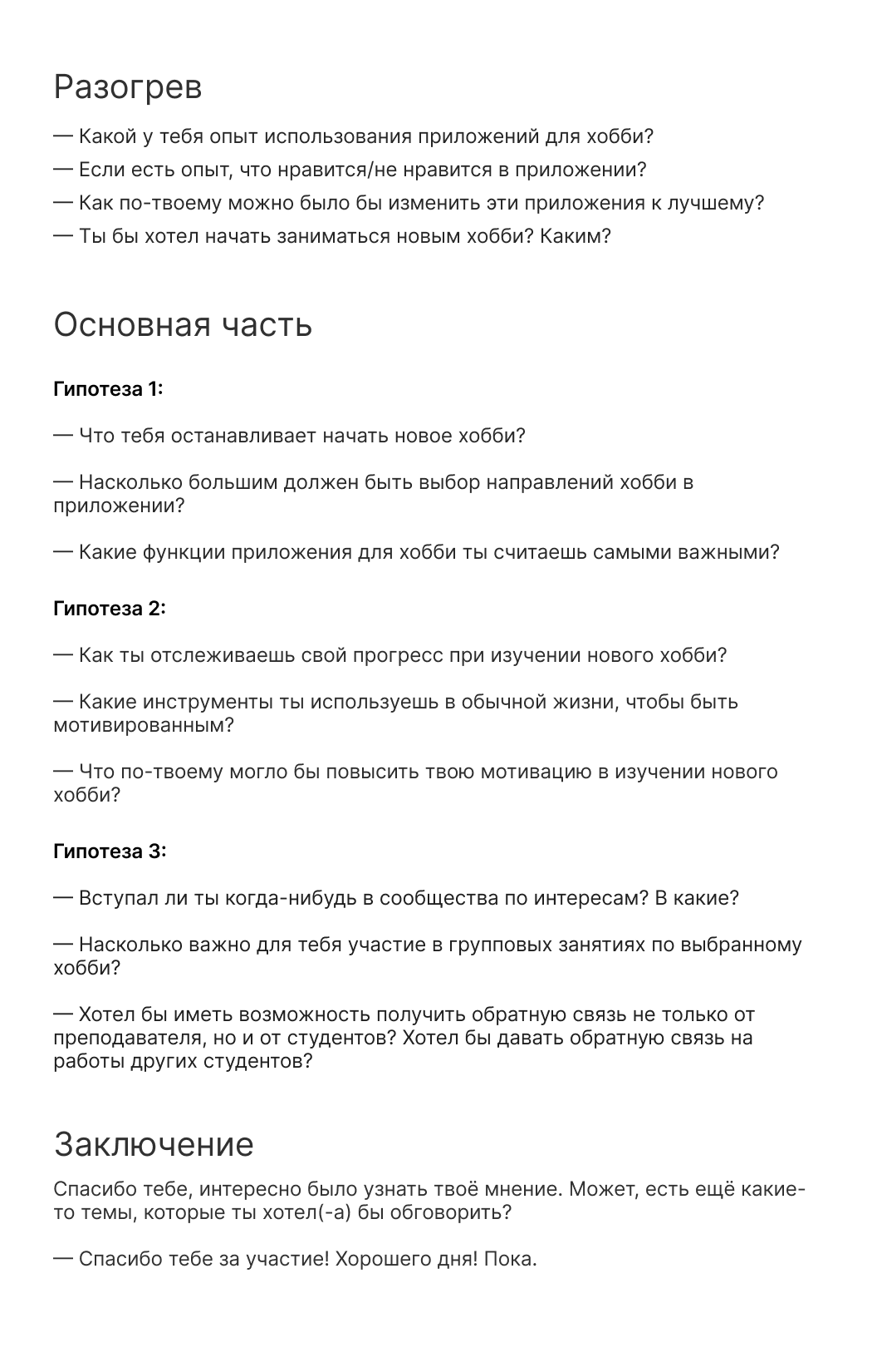
Based on the results of the analysis, hypotheses were drawn up that should be checked at the interview:
9 people were selected from the target audience. The task is to determine what is important for them when working with such an application, to understand the experience and current problems, and to test hypotheses.
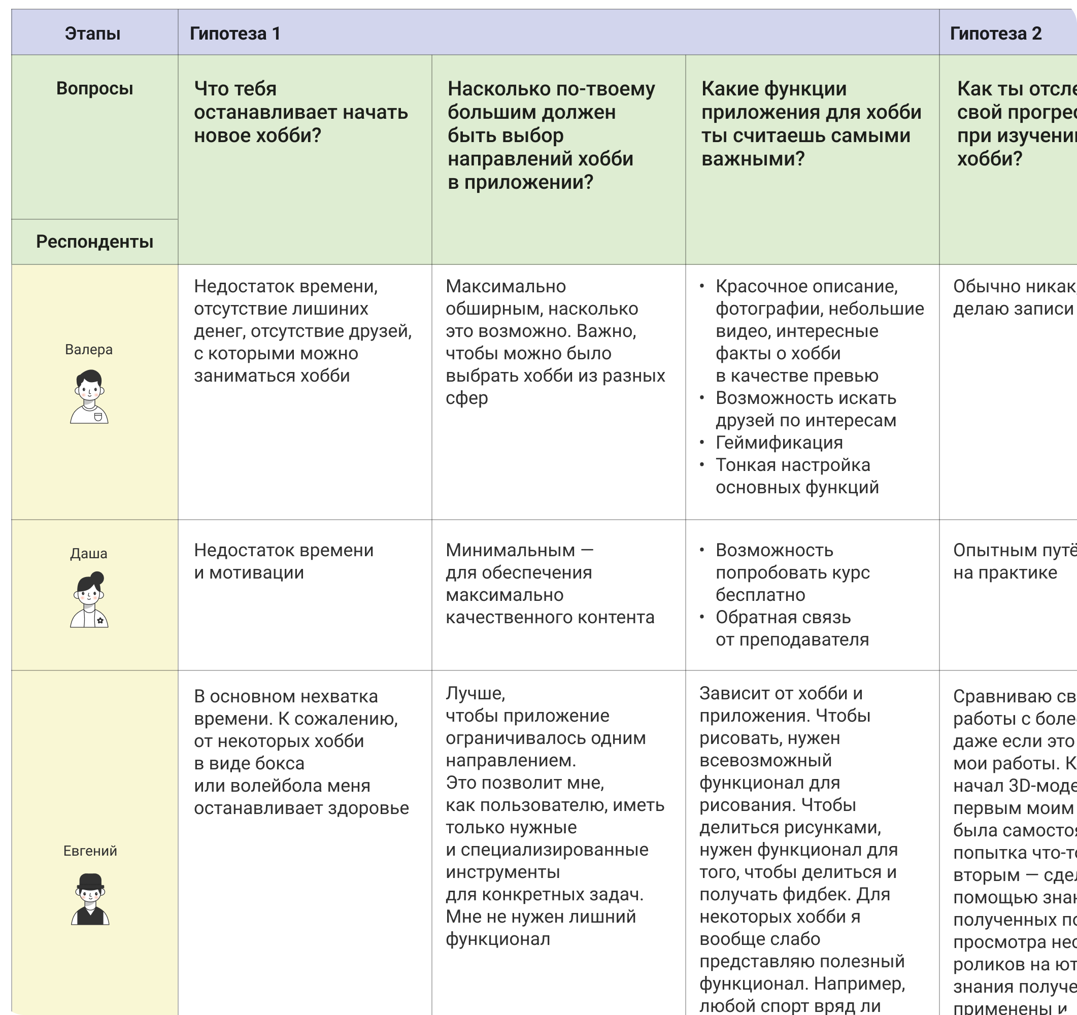
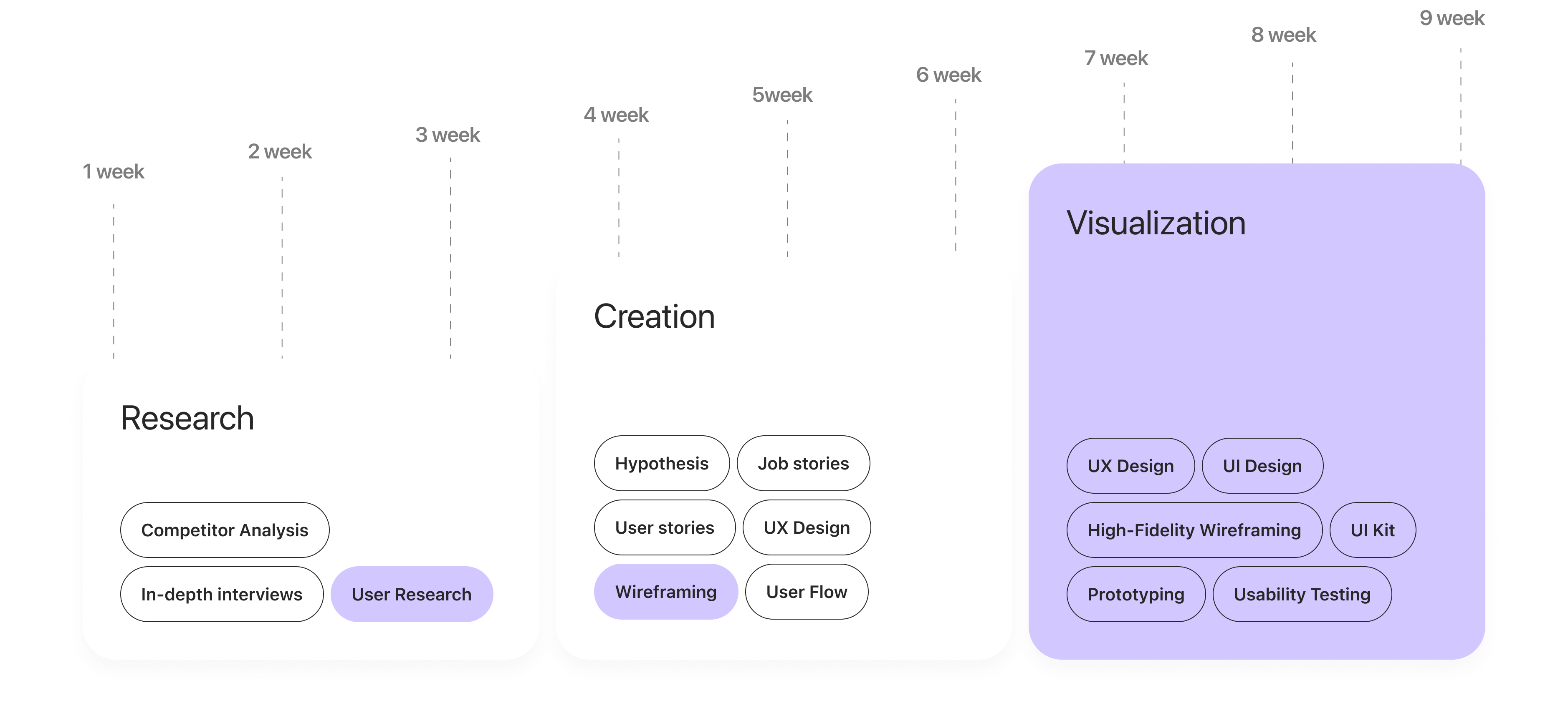
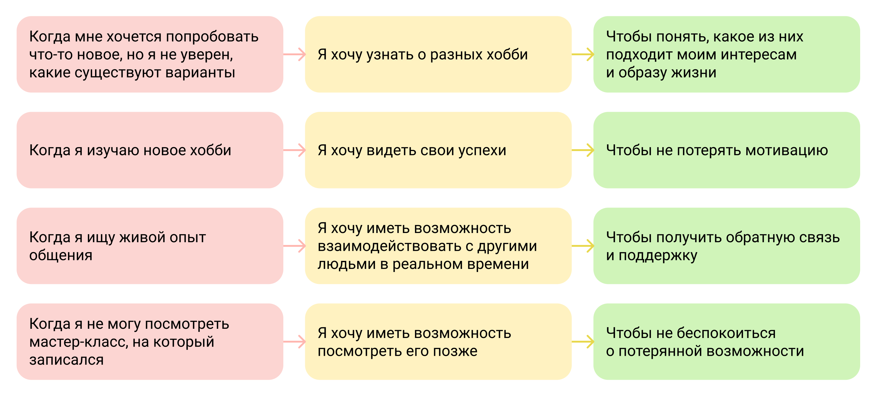
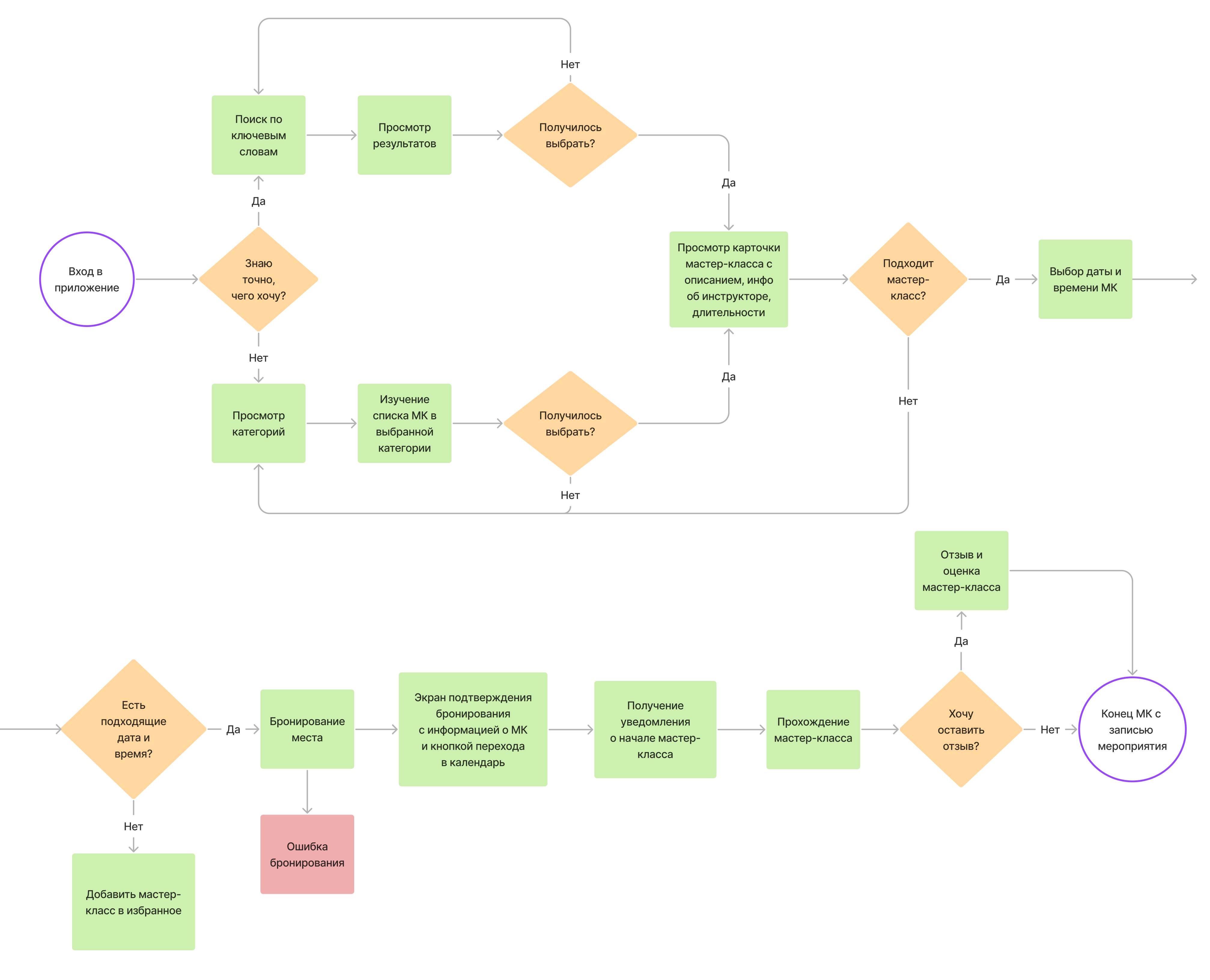
After analyzing competitors and interviewing users, I have compiled the solutions I want to implement and based them on Job Stories and User Stories. Stories will help focus on the user problem. Based on them, created a User Flow - it will help structure data and not miss important details when designing an application.
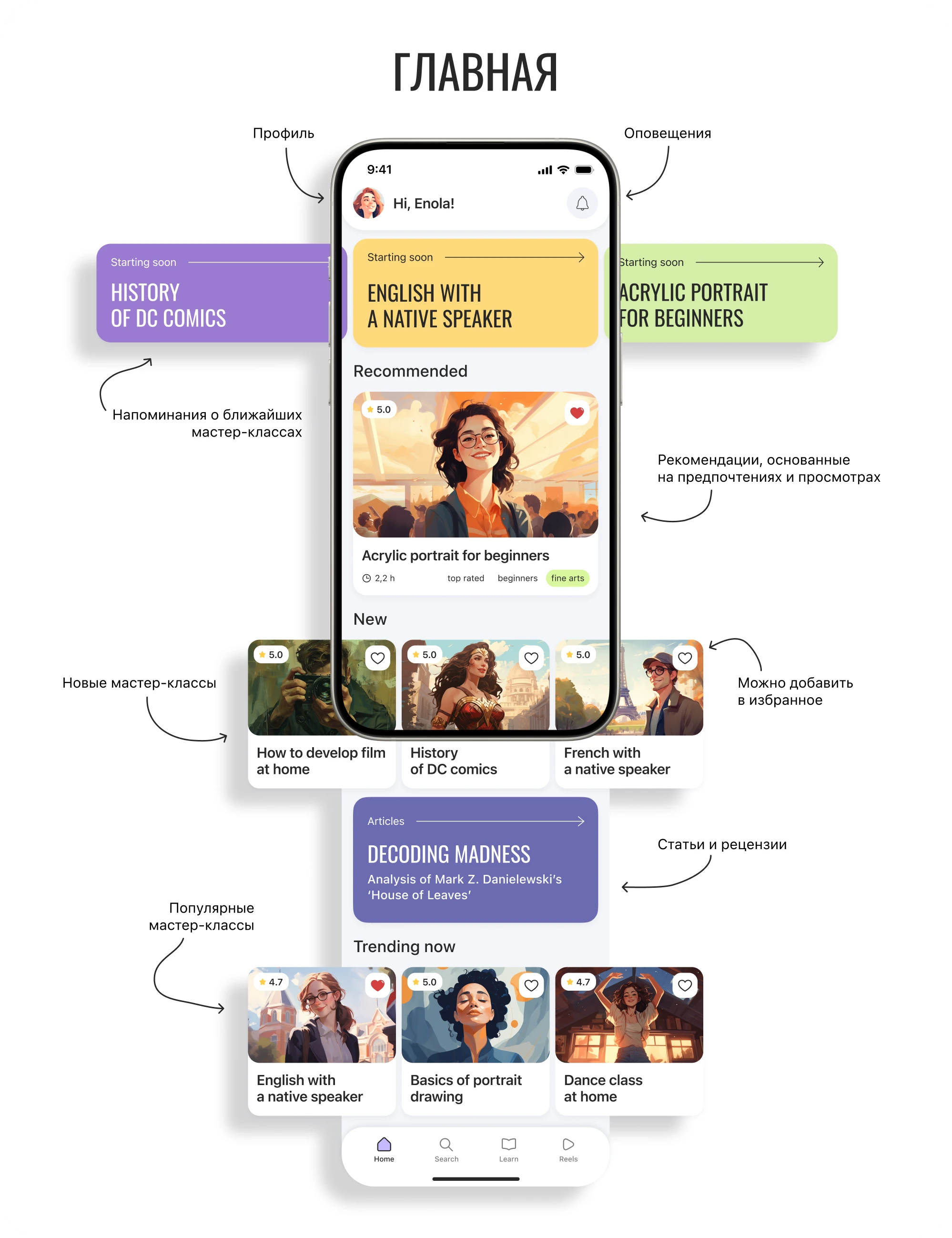
The customer’s wishes for the visual style of the application were as follows: it should be modern, minimalistic, with the use of the app. flashy and attractive graphic elements. The main thing is to be modern, fresh and with high-flying.
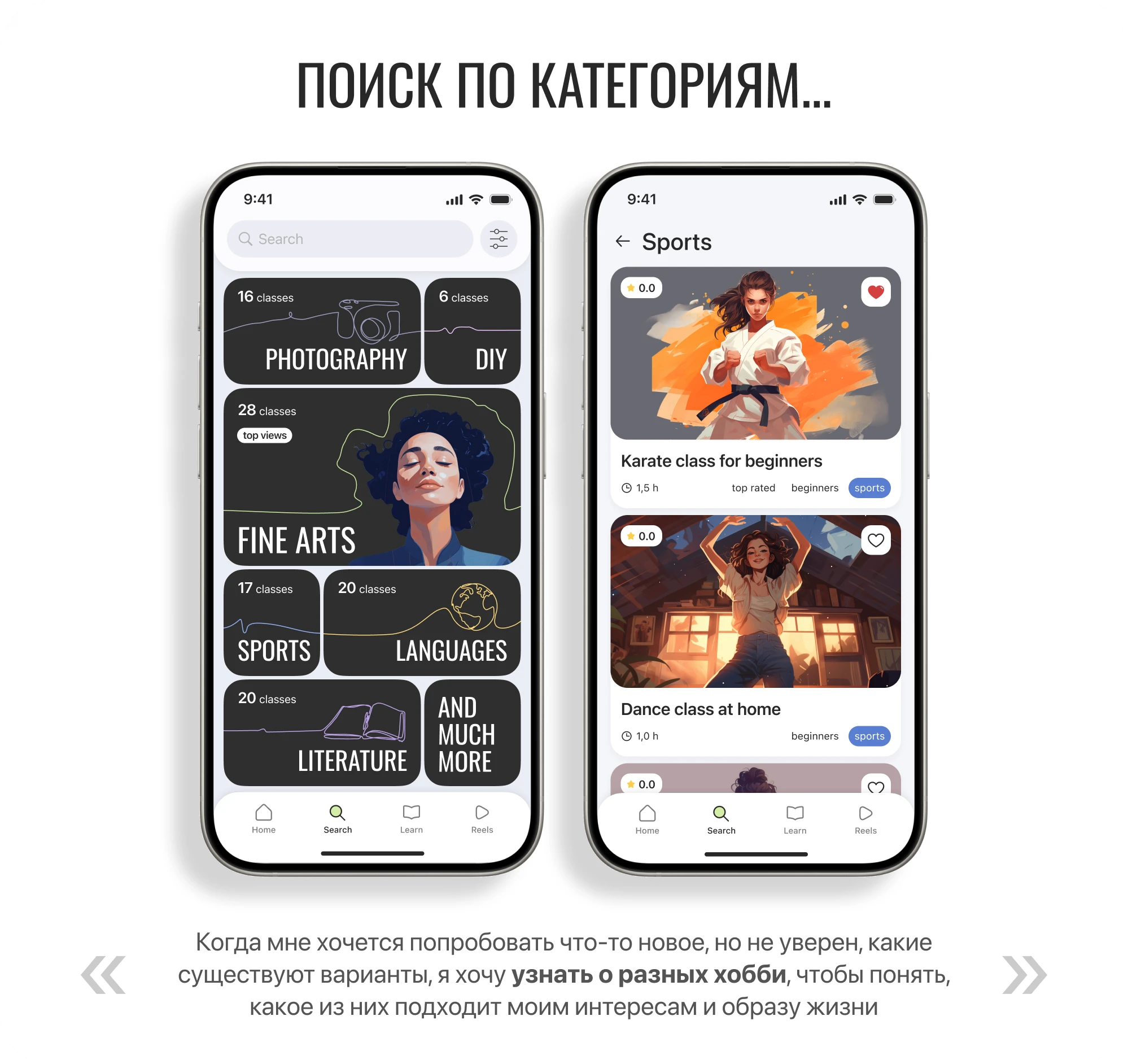
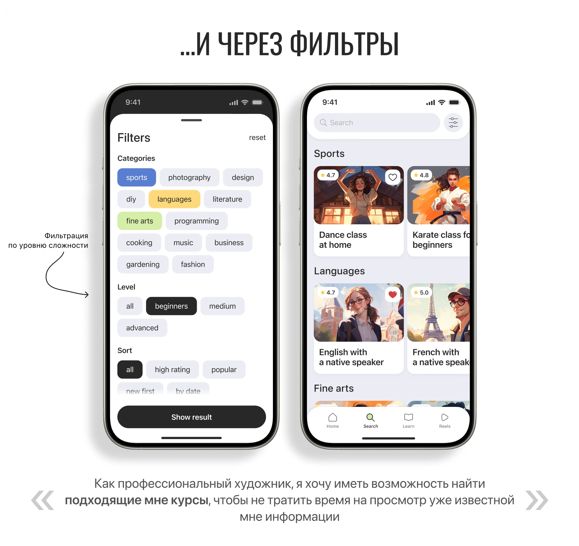

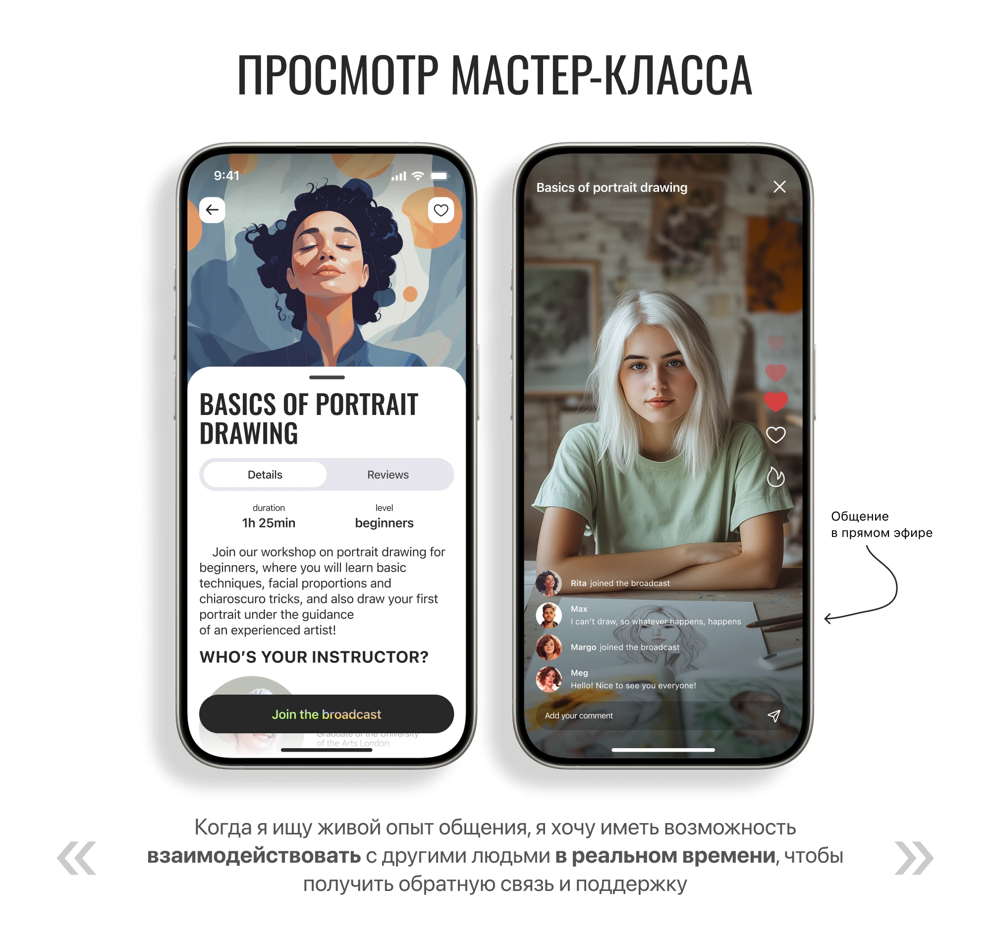
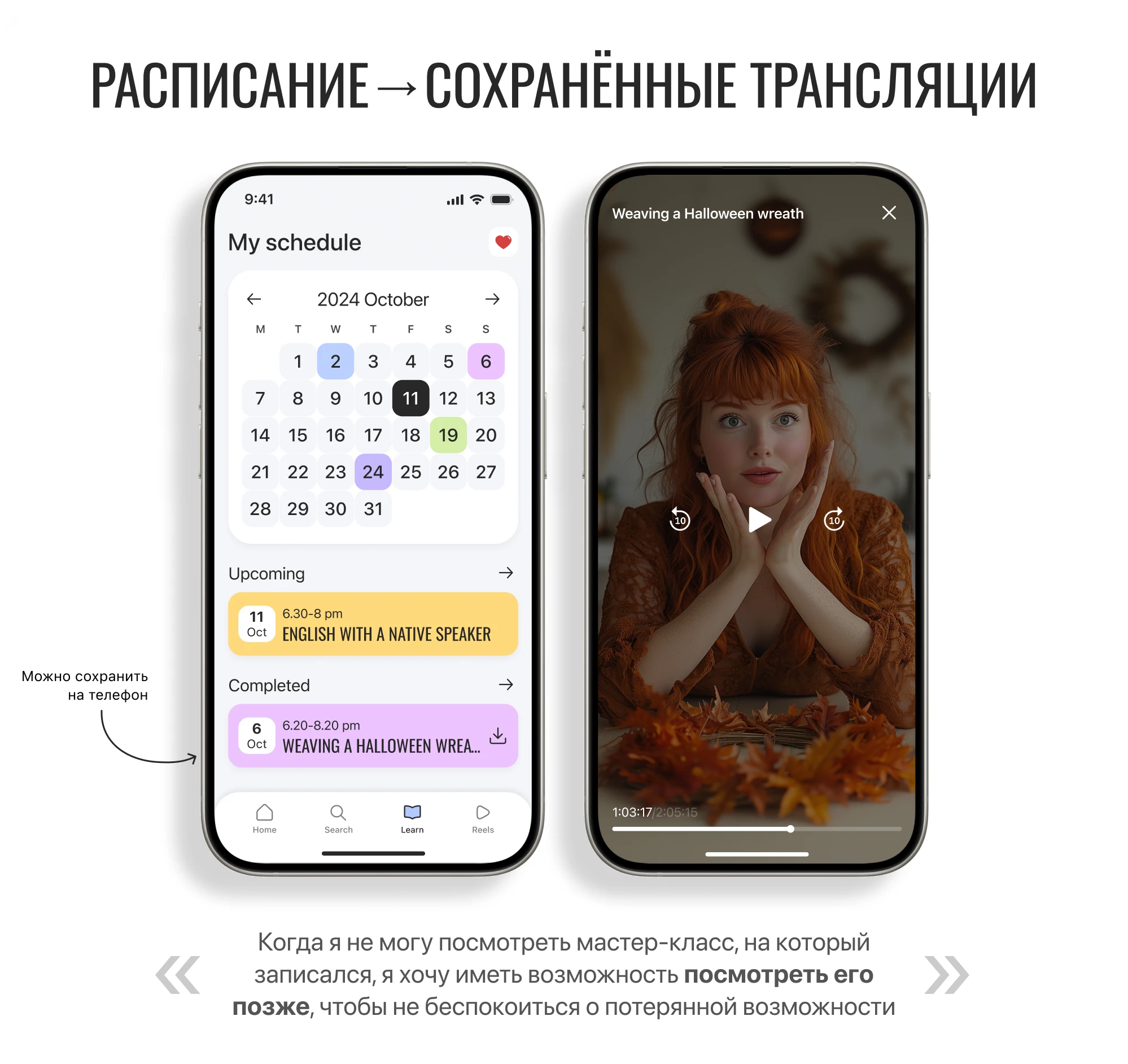
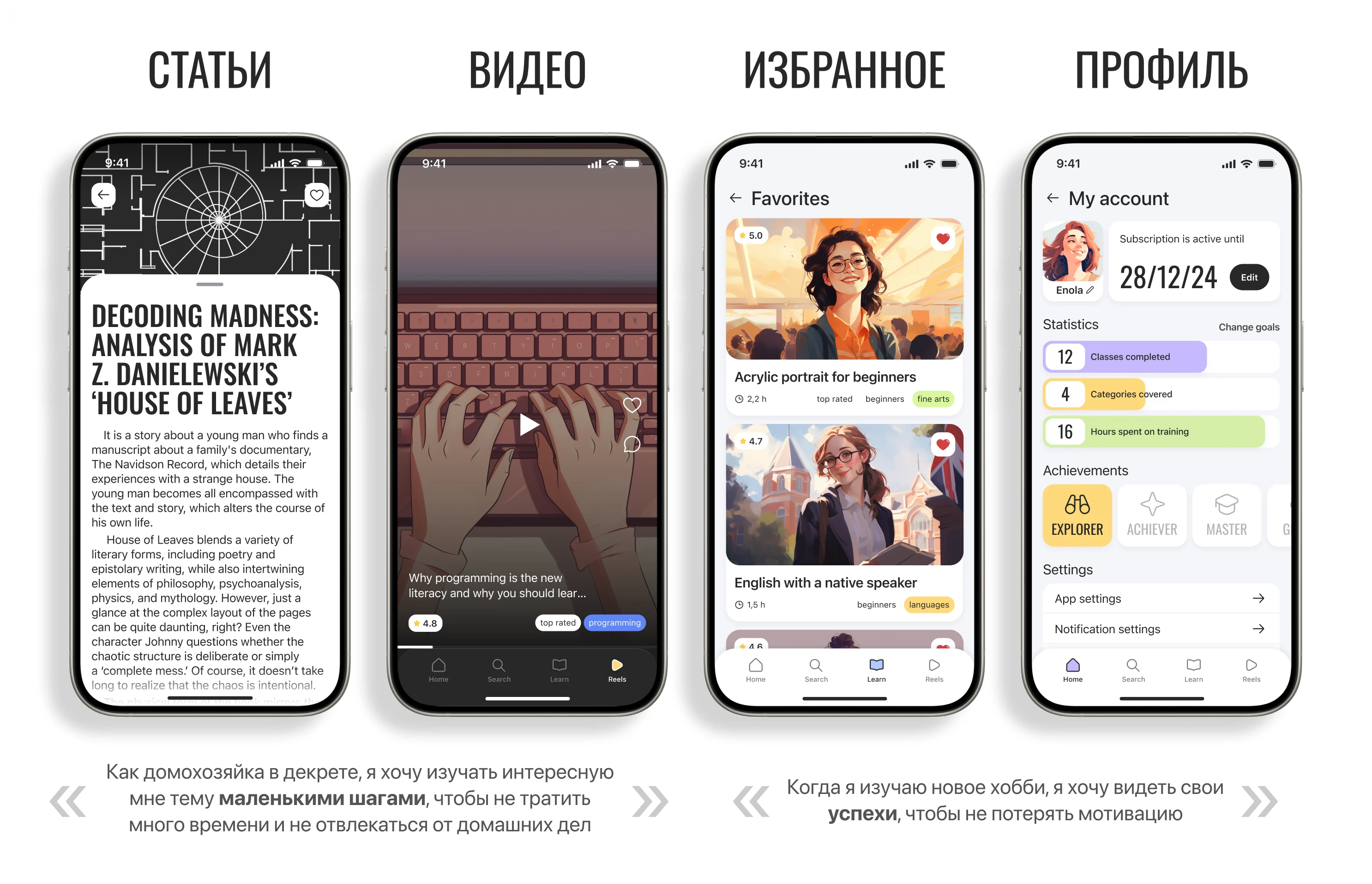
I asked participants to complete a usability test to identify weak points in the experience. Their primary task was to find and register for a workshop, watch the livestream, and leave a rating. Secondary tasks included finding favorites, completed workshops, progress, notifications, and settings. I asked participants to think aloud throughout the session.
| Script | Hypothesis | Criteria for success |
|---|---|---|
| 1. Registration in the app | The user understands that you can register both by phone number and by using mail and social networks. | The user has no problem registering |
| 2. Search for workshop | The user understands that you can search for workshop both in the search bar and using filters. | The user found in a convenient way the desired workshop |
| 3. Registration on the workshop | The user will be able to register on the specified date and time | The user has no problems with registration. |
| 4. Watching the broadcast | The user understands that they need to select Join the broadcast to take part in the livestream | The user clicked on the button "Join the broadcast" to participate in the broadcast |
| The user understands that they can post comments and reactions during the livestream | The user noticed an input for comments and icons with reactions | |
| The user understands that it is not necessary to leave an assessment and review of the workshop | The user noticed the "Skip" button. | |
| 5. Schedule and view of recorded workshop | Users can easily find a schedule section | The user went to the "Learn" tab |
| The user will find past workshop and saved broadcasts | The user clicked on the card with the past workshop | |
| 6. Chosen. | The user will quickly find the selected | The user clicked on the heart icon in the "Learn" tab |
| 7. Profile | The user will quickly find progress and rewards. | The user clicked on the avatar on the main tab |
| The user will understand that by clicking on the profile photo you can change the name and photo | User clicked on profile photo | |
| 8. Alerts | The user will quickly find notifications. | The user clicked on the bell icon on the main tab |
The main scenario is clear to users and does not require significant changes. Further improvements should focus on secondary scenarios: make the transition to the favorites more noticeable, simplify the search for past master classes and broadcast recordings, and provide the opportunity to hide comments in the past. Time to broadcast so they don't cover up the video.
I managed to effectively organize the work of the design team, which allowed to improve processes and coordinate efforts. In addition, I studied the navigation patterns in mobile interfaces more deeply, and my decisions were confirmed by the results of user tests.
Unless expressly stated otherwise, the texts, structure and design of the site, graphics, illustrations, images and other materials created by me are subject to copyright.
Copying, reproduction, modification, publication, distribution, placement on other resources and other use of these materials for commercial or non-commercial purposes without prior written permission is not allowed.
Trademarks, logos, company names and materials of third parties belong to the respective copyright holders and are presented on the site exclusively as part of a portfolio.