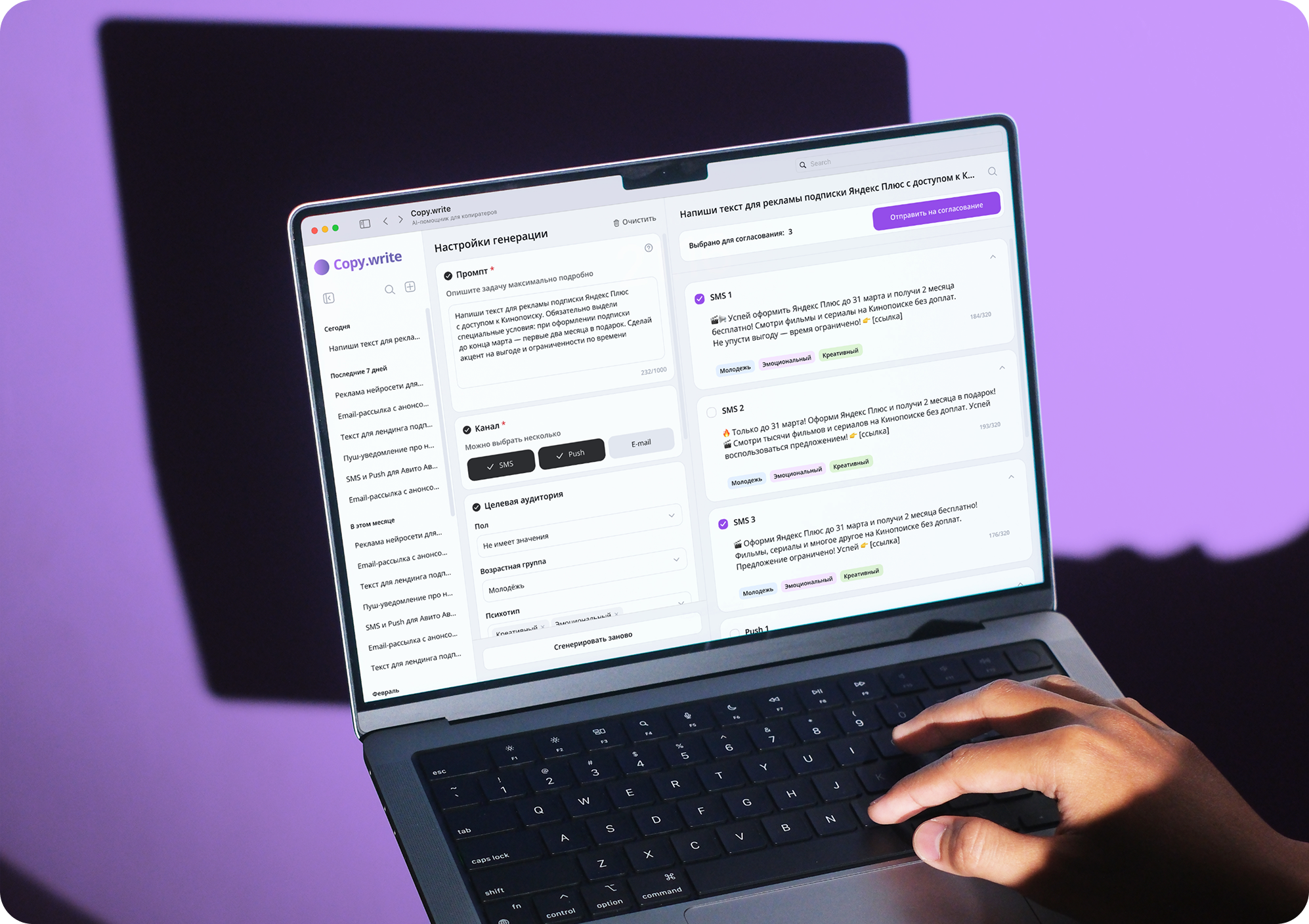
A service that will help you quickly create text content for mailings.
Defining the problem
After the course in Chulakov’s studio, I underwent an internship, at which they came to me with this introductory:
“We need a service that can generate text quickly – copywriters lack speed, especially when you need many variations on a single message.”
Inputs
General idea of the product
Target audience (pro-copywriters)
The task is to automate and speed up writing texts through AI
List of interface structure constraints from a team of researchers
Goal
To make a tool that will help copywriters not only to quickly receive versions of texts, but also conveniently work with them - edit, compare, send for approval. At the same time, everything should be clear and without unnecessary clicking.
Audience
Professional copywriters who already have the experience and understanding of what they want.
Constraints
The researchers of the studio conducted a discussion and issued mandatory requirements:
Three areas: chat list, generation settings, model response area
Fields and blocks in settings - strictly defined
Clear limits on the number of characters and the number of options
Tools for working with texts - editing, copying, sending for approval
Discovery
First, I went to watch services with similar functionality, passed the main scenarios and highlighted common features.
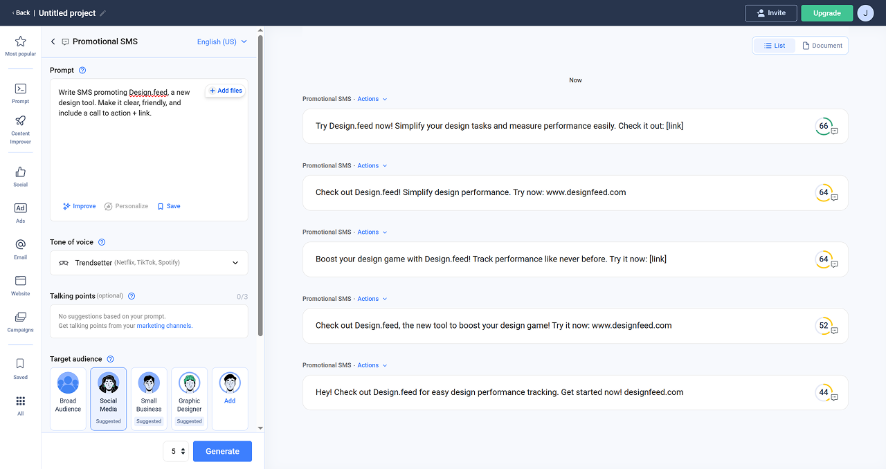
I took 5 services: jasper.ai, anyword, rytr.me, gerwin.io, writeronic. They all basically have the same structure. On the left side of the screen there is always a sidebar menu. The block with the generation settings follows and usually takes up a third of the entire screen, it indicates the prompt and details of the desired result. Most of the screen is occupied by the generation area - in it the model gives a result that you can work with. Each block has its own vertical scroll, all the important elements are always in sight. I decided to take this structure as a basis.
Anyword
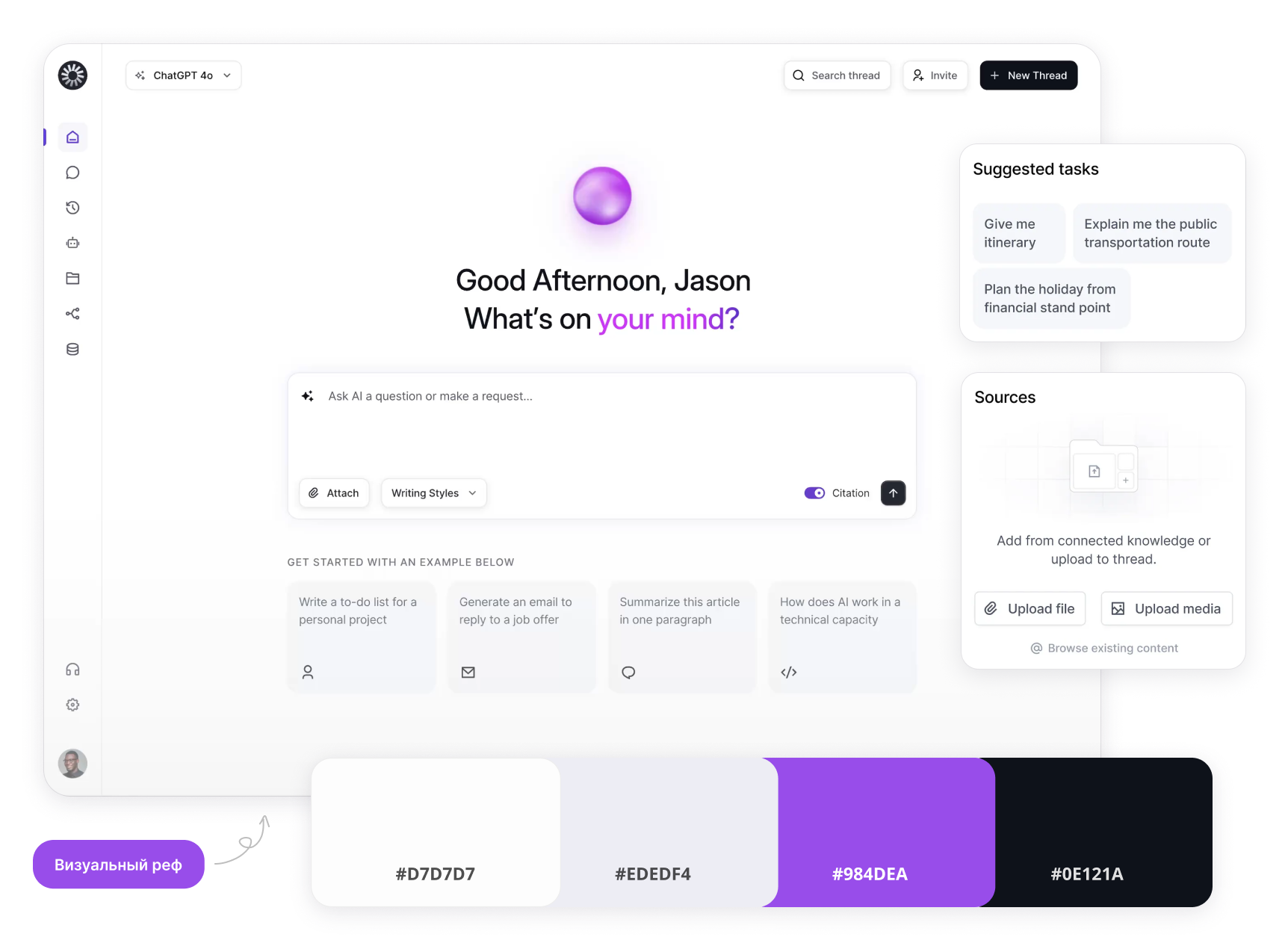
Next, I defined the visual direction for the service: its palette, typography, and overall tone—a clean, approachable interface that supports a professional and productive atmosphere.
After that, the prototype was assembled, which takes into account all the necessary restrictions.
Solution
First iteration
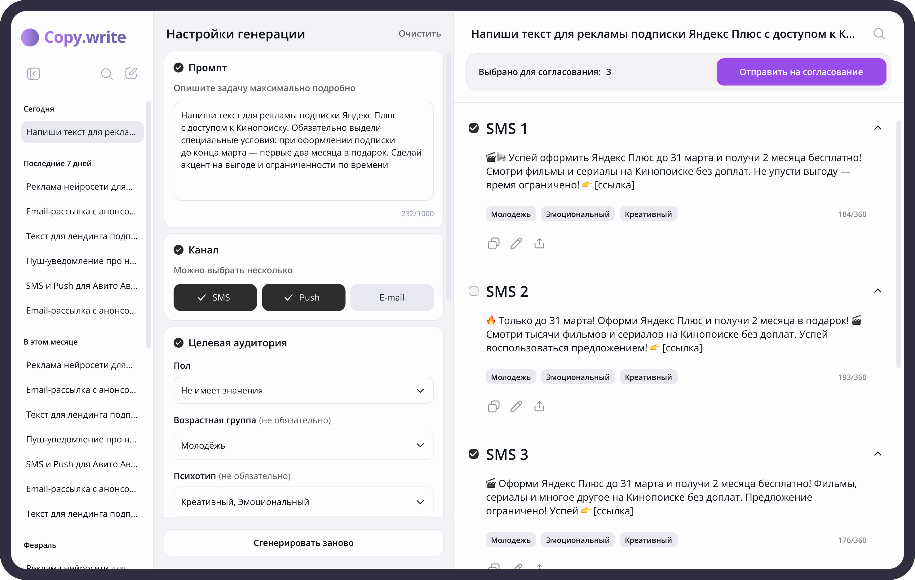
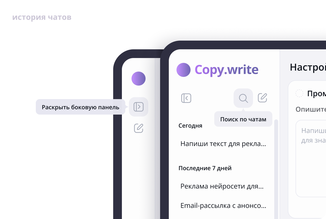
In sidebar removed the history of chats, as in popular chatbots (ChatGPT, Deepseek). On the instructions of researchers, the history of generation should always be in quick access. This is because copywriters often have to go back to old chat rooms to rewrite a detail like a date or holiday name. sidebar can be folded when the user is working in the main area. To quickly find the desired chat, added search chat.
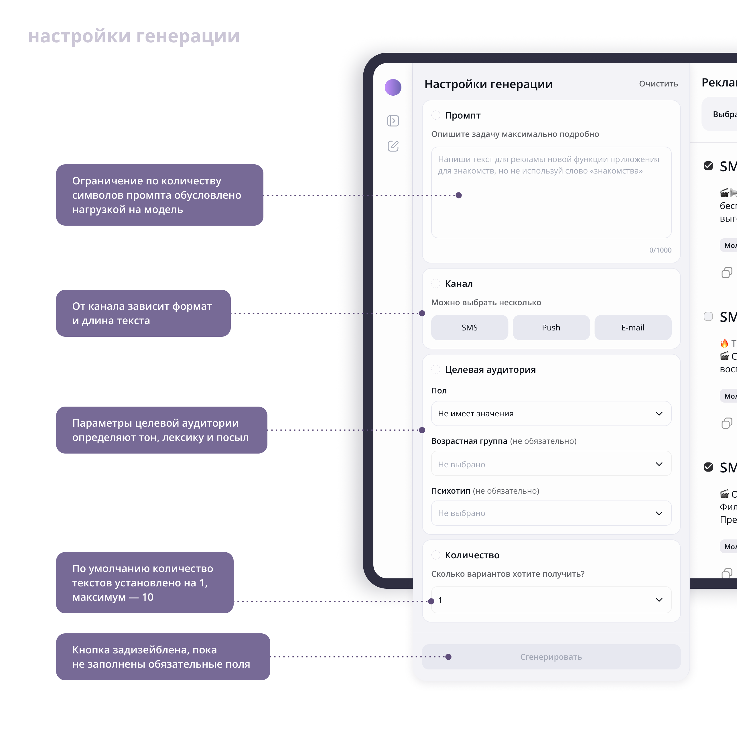
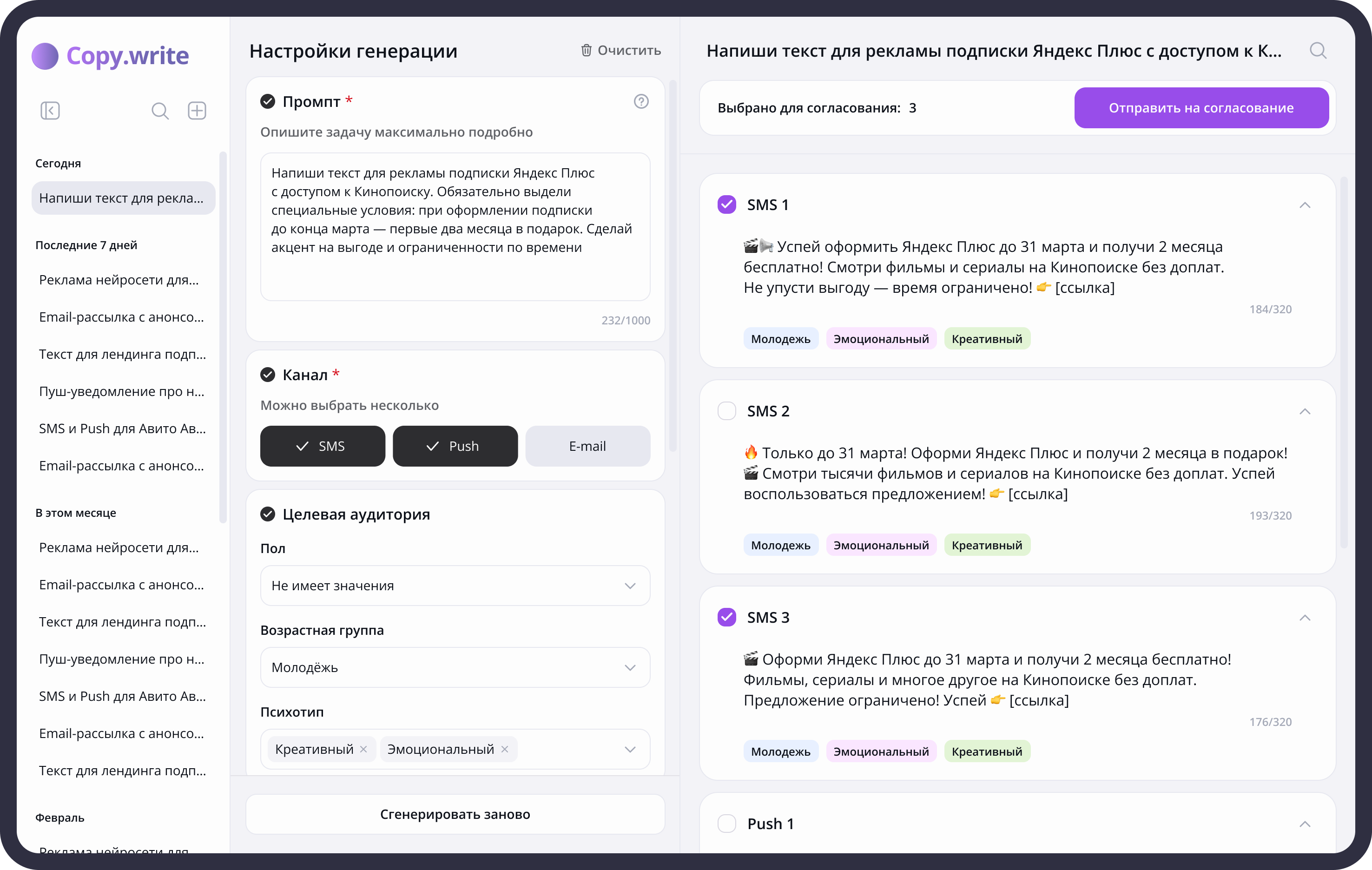
In the generation settings, 4 areas were made: the field for the prompt, the field with the channel selection, the target audience and the number of options.
Prompt is the basis. Without a clear request, the neural network will not be able to give the desired result. A 1000 character limit encourages you to be specific.
SMS, Push and Email are the channels with which the target audience of the service works. The format and length of the text depends on the channel. SMS is one sentence and Email is a full paragraph. The choice of the channel made the tabs larger to make them more visible. This is one of two mandatory settings, without which to start the generation will not work.
In the block with the target audience there are 3 parameters: gender, age and psychotype. They define the tone, the vocabulary, and the message, all based on who the reader is. Psychotype is an interesting parameter that can affect emotionality and presentation style.
The number of options is by default 1, maximum 10. The restriction is related to the load on the model. Usually this amount is enough, but if necessary, you can start the generation again, and the model will add new options to the old ones.
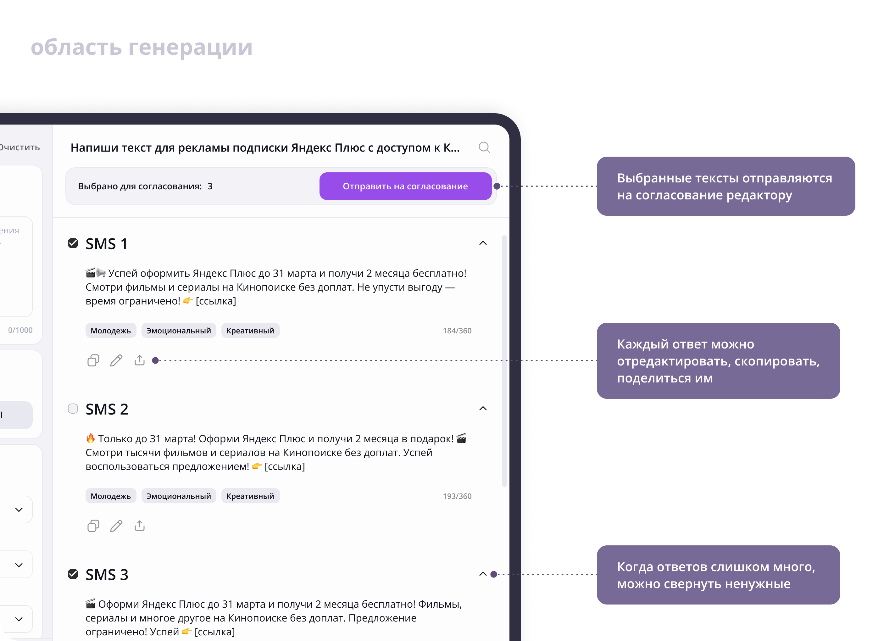
In the field of generation, in addition to the results themselves, there is a “Send for approval” button. According to the TK, the selected texts are sent for approval to the editor. Each answer can be edited, copied, shared. When there are too many answers, unnecessary ones can be removed.
Changes made after hallway usability testing
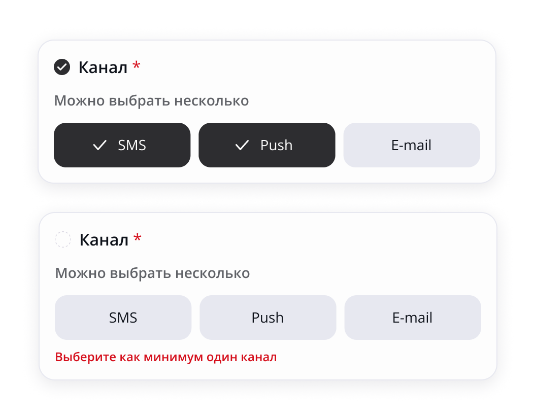
I added required-field indicators and validation errors for the prompt and channel fields. The Generate button remains disabled until all required fields are complete. Clear guidance and validation help users understand what is missing, correct errors, and reach a successful result.
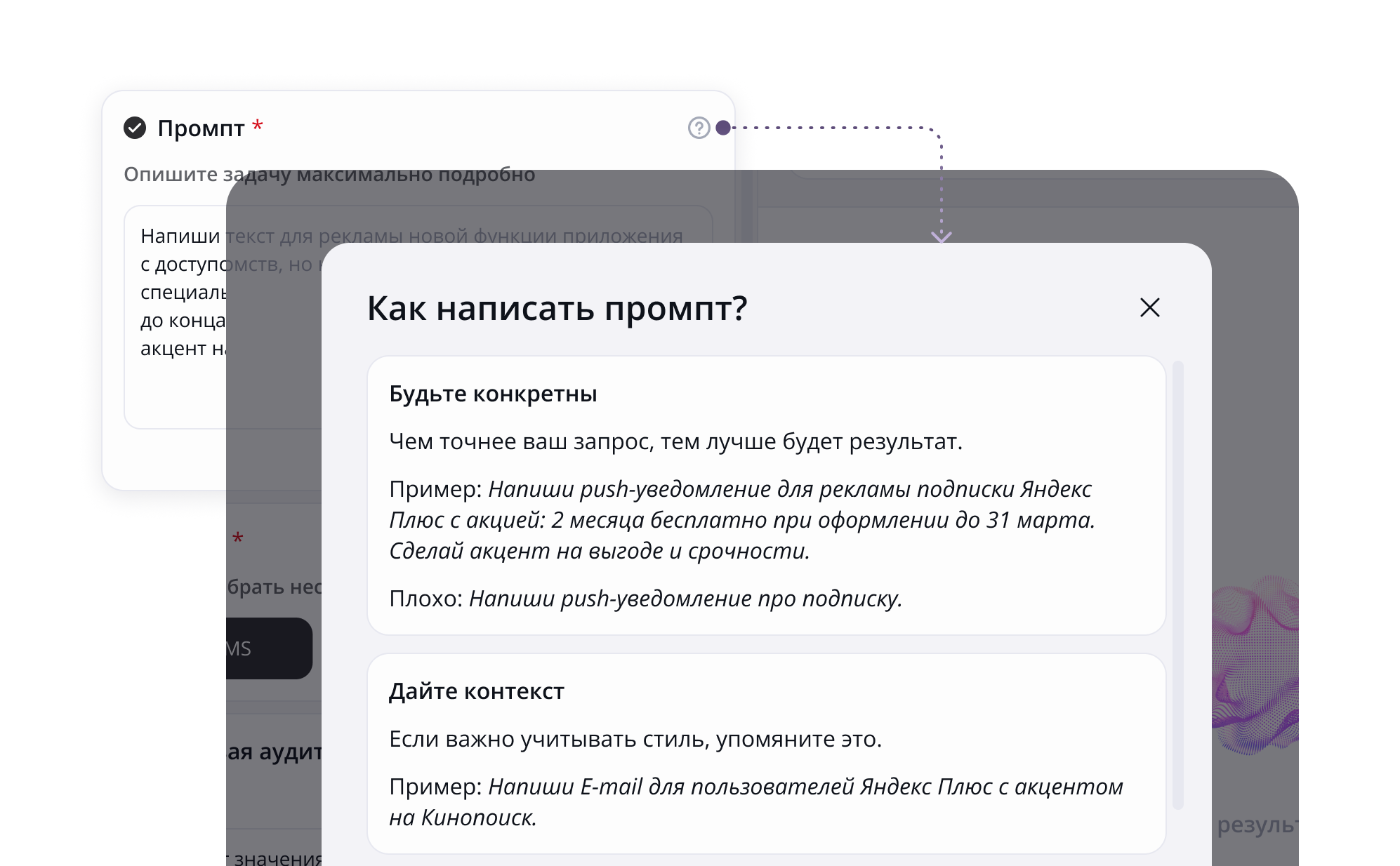
I added an icon with a question for instructions on how to write prompts. Not all professional copywriters are familiar with chatbots and may have difficulty creating an effective prompt.
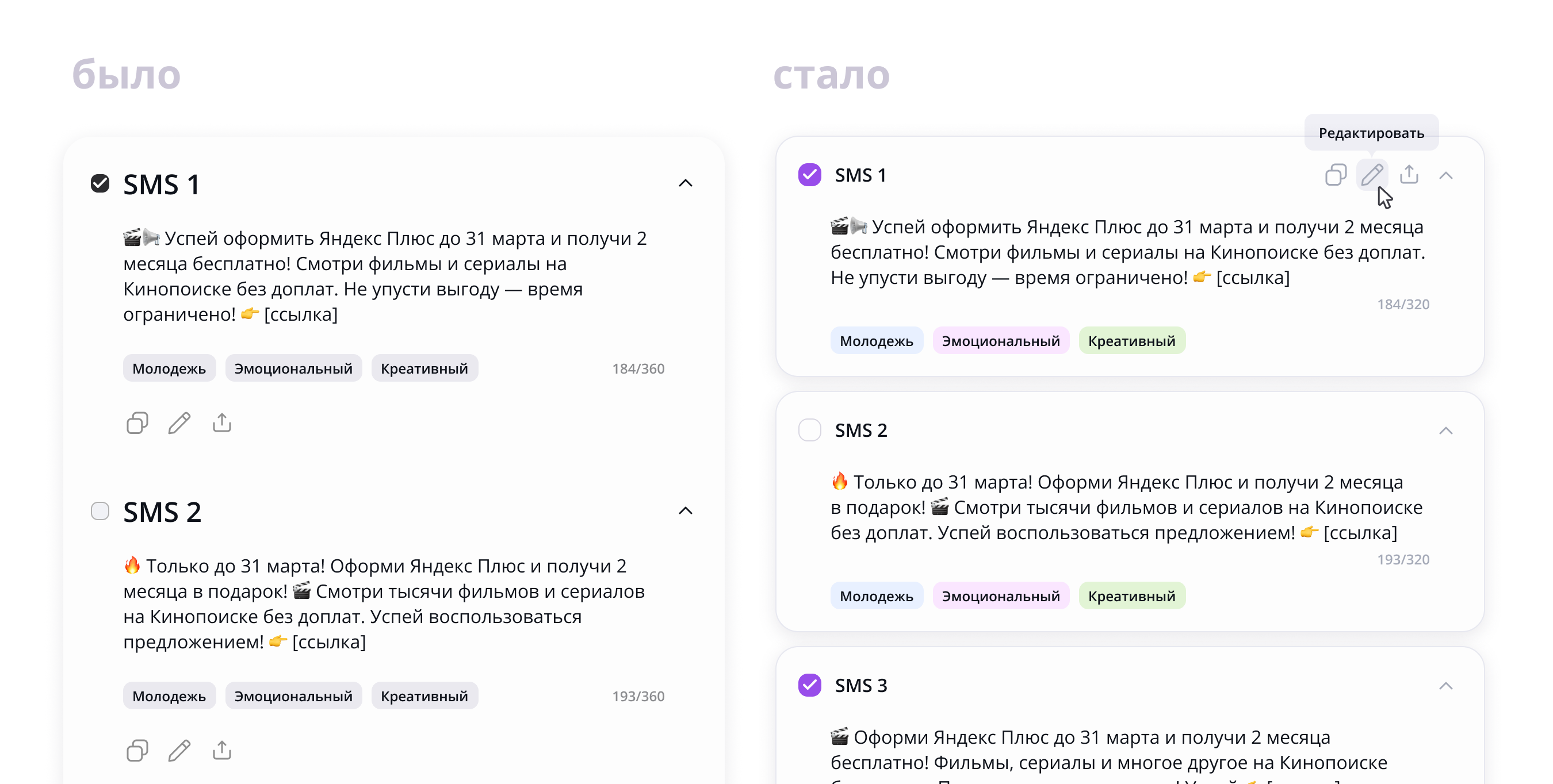
Placed messages in the model's response to the substrates for better reading. When there are too many answers, the text can merge into a solid canvas, and this will increase the cognitive load.
Worked hierarchy of texts and elements in blocks with messages. checkboxes made it bigger to make it easier to click on them, and the name of the messages, on the contrary, was reduced so that they did not argue with the header of the block.
Controls in the generation moved up and showed on guidance. Reduce the visual noise of repeating elements.
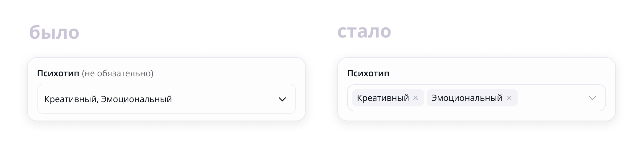
Elements multi-select made chips for greater visibility. Now they are better read and removed with one click on the cross.
I changed the new-chat icon. Participants in the hallway usability test did not immediately understand the pencil icon, while they recognized the plus icon straight away.
Second iteration
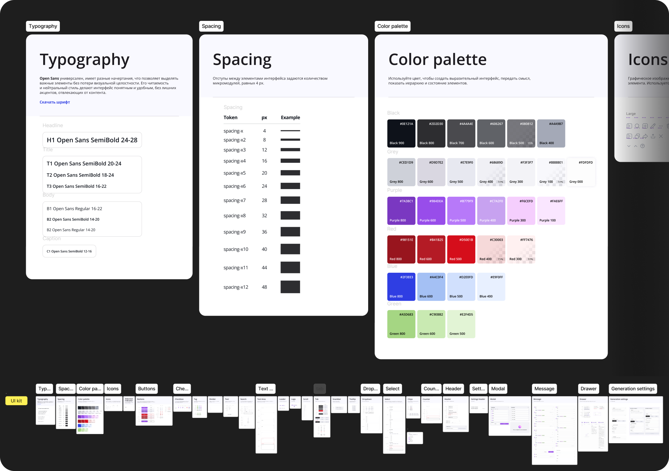
After the final edits, I designed a visual: I added a palette, assembled a ui-kit. Made a detailed flow of chat creation, search and editing text and presented to the team.
UI kit
Outcome
It turned out to compactly fit all the important information on one screen so that the user does not have to switch between tabs.
The project received a positive feedback, and I gained valuable experience, a lot of useful feedback and fell in love with the process even more.
What would I do better if I had more time and impact?
Added prompt templates for different types of tasks – so as not to waste time formulating from scratch every time.
Worked on sending for approval - would add statuses, the possibility of commenting. Now it's just a button, and you can develop into a full mini-floo.
Conducted research among copywriters of the studio to ensure the correctness of decisions.
Unless expressly stated otherwise, the texts, structure and design of the site, graphics, illustrations, images and other materials created by me are subject to copyright.
Copying, reproduction, modification, publication, distribution, placement on other resources and other use of these materials for commercial or non-commercial purposes without prior written permission is not allowed.
Trademarks, logos, company names and materials of third parties belong to the respective copyright holders and are presented on the site exclusively as part of a portfolio.