
Problem: Copywriters often need to prepare several versions of the same message quickly for different channels and audiences. AI can accelerate the first draft, but without convenient tools for comparison, editing, and approval, the results still require a fragmented manual workflow.
Service for copywriters
Designed an AI service for professional copywriters where they can generate campaign copy variants, edit and compare texts, and send selected options for approval.
Responsibilities: competitive analysis, UX/UI design, prototyping, hallway usability testing, and UI kit

Context
Task: Design a workspace that generates multiple copy variants from defined parameters and supports the entire process from generation to approval without switching between services.
Business value: The solution should reduce campaign preparation time and simplify collaboration between copywriters and editors.
Inputs
At the start, the team provided the target audience, the required generation parameters, and the basic interface structure. The service had to include chat history, request settings, and an area for model-generated results.
Audience: Experienced professional copywriters with clear expectations of the output they need.
Constraints
The constraints covered the set of fields, prompt length, number of generated variants, and required actions with text: editing, copying, and sending it for approval.
Discovery
I analyzed five AI writing services: Jasper, Anyword, Rytr, Gerwin, and Writesonic. I followed the flow from request setup to working with the generated result and compared the products across four criteria:
- Organization of generation history
- Request parameter setup
- Comparison and editing of results
- Reuse and handoff of finished copy
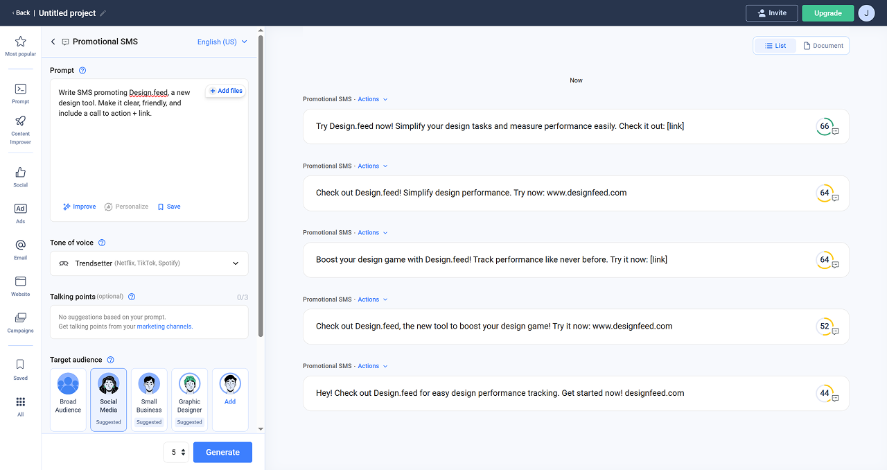
Analysis findings
In most services, history, settings, and results are divided into three distinct areas. This structure preserves the task context and makes it possible to work with several variants without moving between screens. I used this principle as a foundation and adapted it to the workflows of professional copywriters.
Next, I defined the visual direction for the service: its palette, typography, and overall tone—a clean, approachable interface that supports a professional and productive atmosphere.
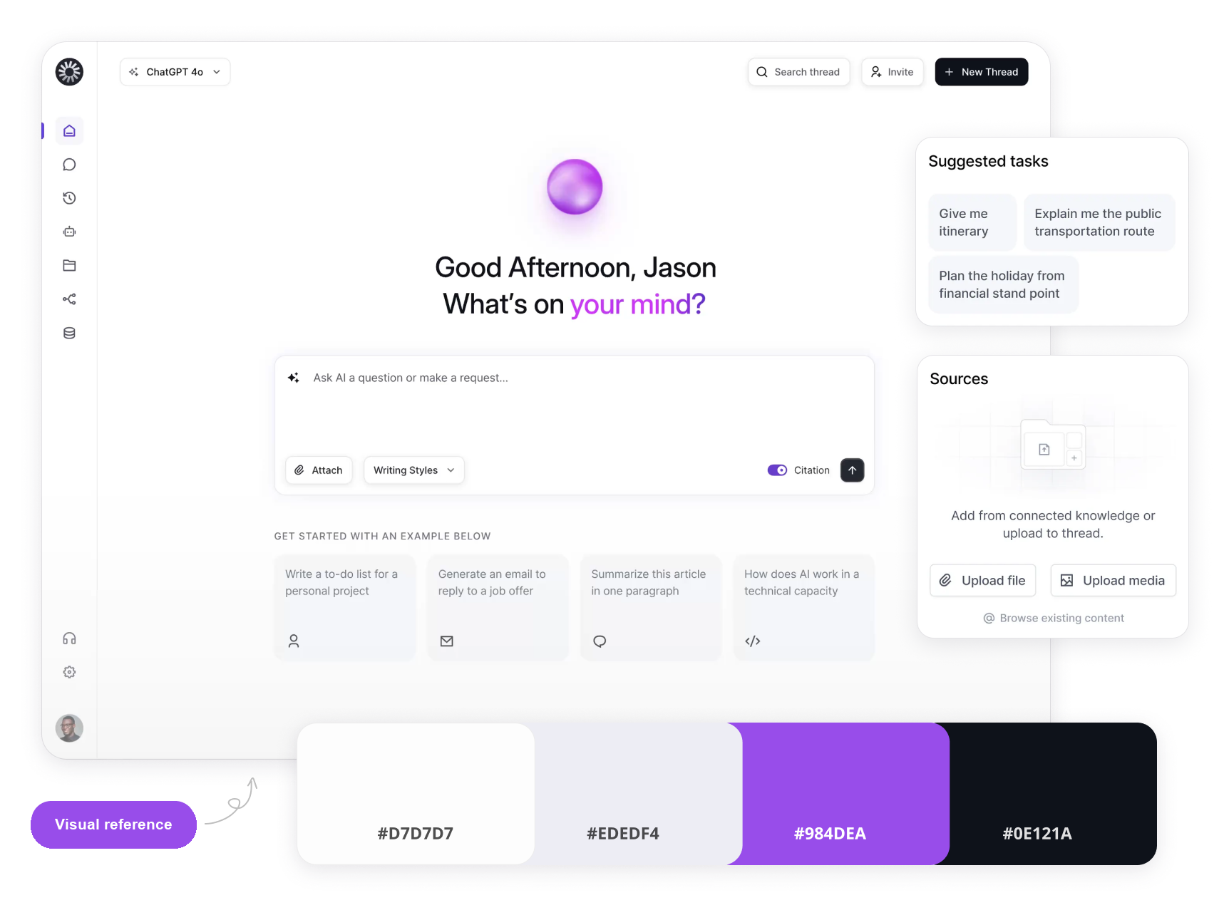
I then created a prototype that incorporated all of the defined constraints.
Solution
First iteration
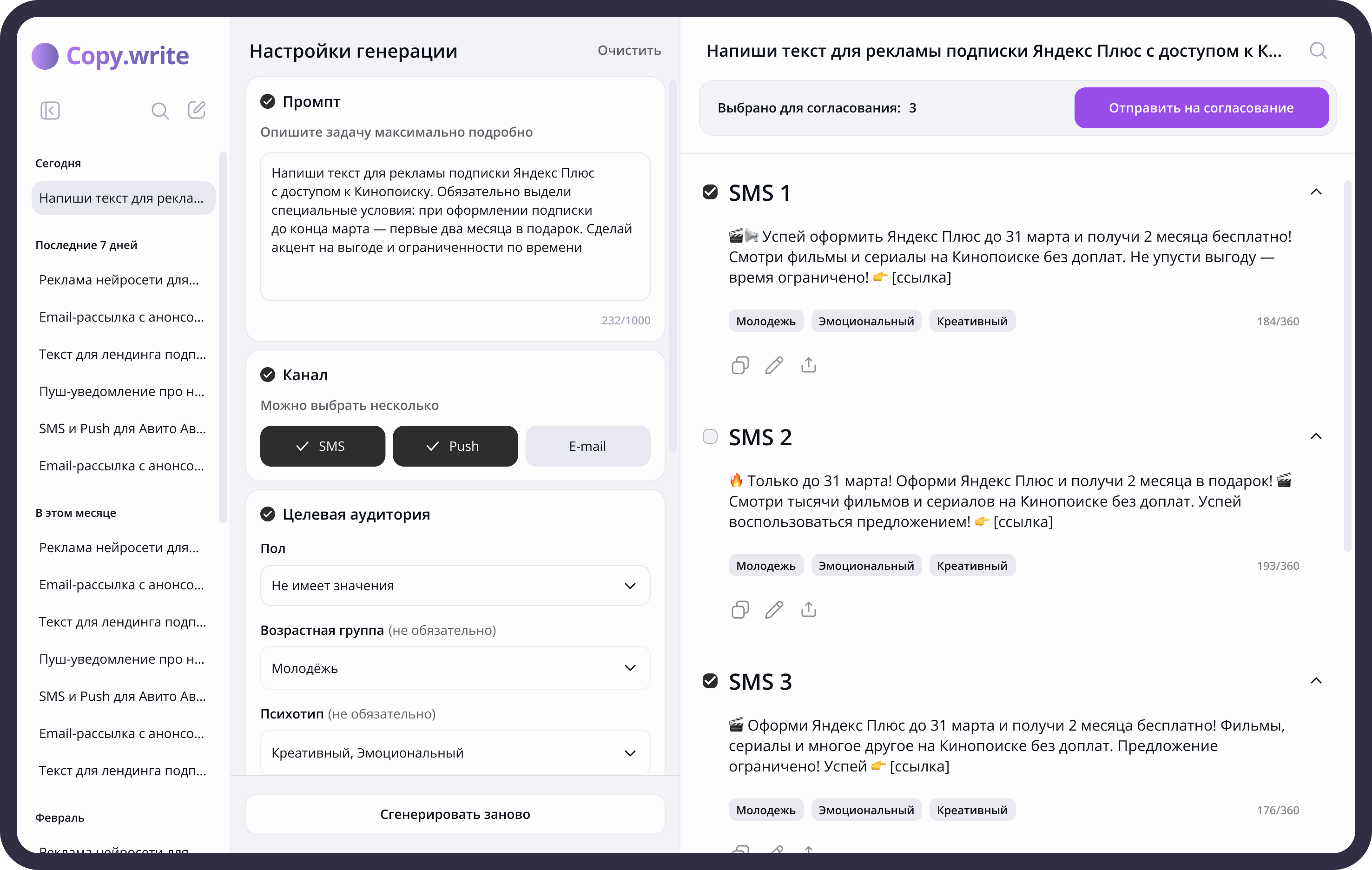
Task. Return to previous tasks quickly.
Problem. Copywriters often need to update old texts and create variations of previously prepared messages.
Solution. The sidebar contains searchable generation history and can be collapsed to free up space while working on the current text.
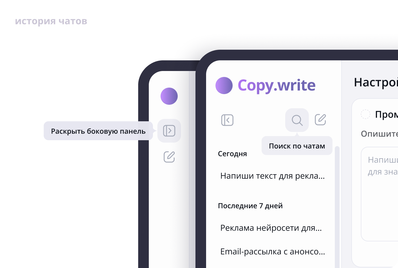
Task. Control the generation result.
Problem. Campaign format depends on the channel and audience, so a text prompt alone is not enough to produce a suitable result.
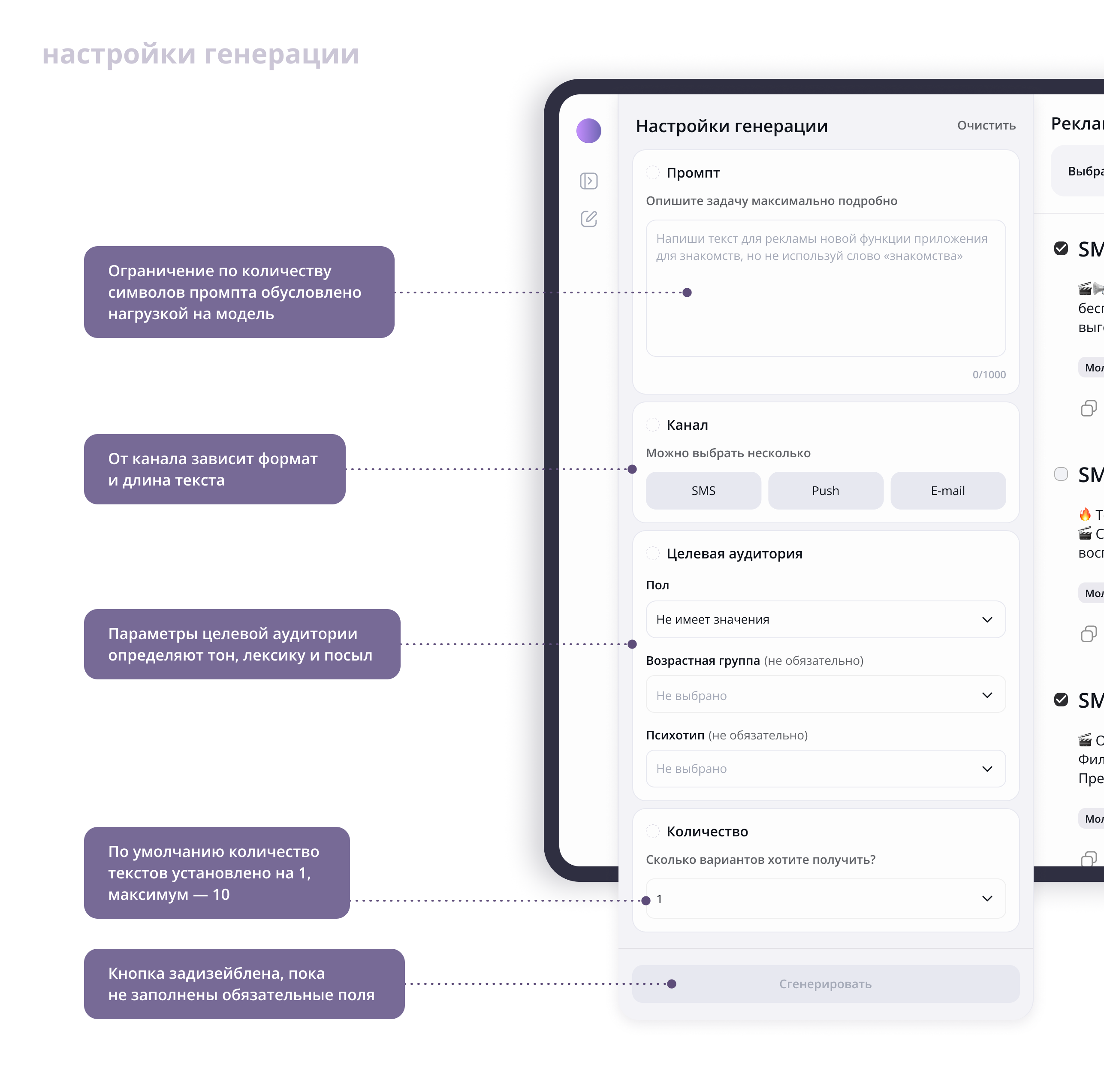
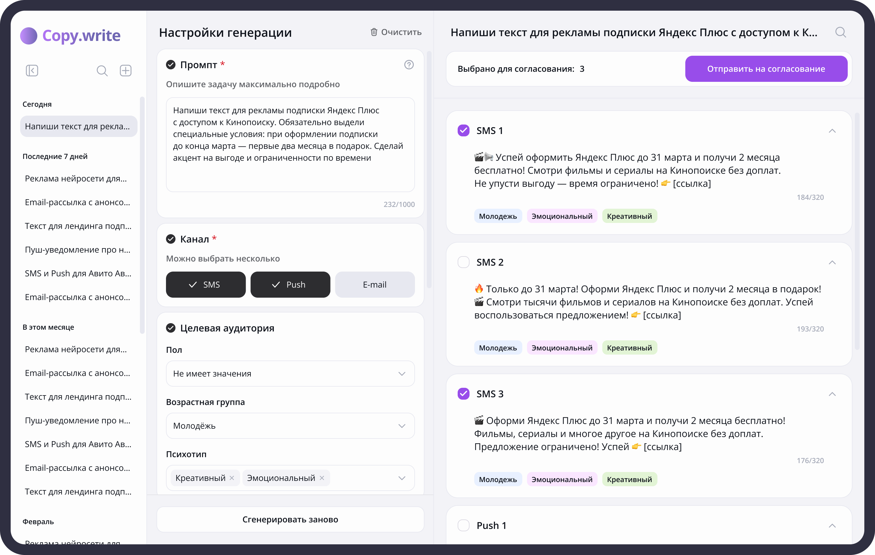
Solution. The settings combine the request, communication channel, audience parameters, and number of variants. Required parameters are highlighted, and generation becomes available once they are complete.
I divided the generation settings into four areas: the prompt, channel, target audience, and number of versions.
The prompt is the foundation of the request. Without clear instructions, the model cannot produce the intended result. A 1,000-character limit encourages users to be specific.
SMS, push notifications, and email are the channels used by the service’s target audience. The selected channel determines the length and format of the copy: an SMS may be a single sentence, while an email can be a full paragraph.
I made the channel tabs larger and more prominent because channel is one of the two required settings and generation cannot start until it is selected.
The target audience section includes three parameters: gender, age, and psychographic profile. Together, they shape the tone of voice, vocabulary, and message for a particular reader. The psychographic profile also affects the emotional tone and presentation style.
One version is generated by default, with a maximum of ten to manage model load. This is usually sufficient, but users can run generation again to add more versions to the existing results.
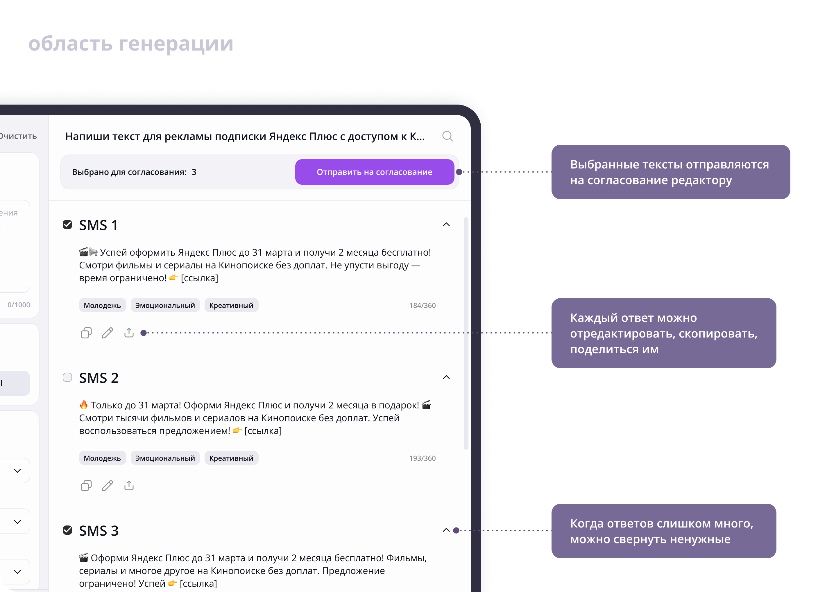
Task. Select and prepare copy for approval.
Problem. When many variants are generated, it becomes difficult to compare responses and separate suitable options from the rest.
Solution. Each variant can be edited, copied, collapsed, or selected for editor review, allowing users to process results within one workspace.
Changes made after hallway usability testing
I tested the first iteration through hallway usability sessions with four participants. They created a new chat, configured a generation request, received several copy variants, and selected one for approval.
During the sessions, I observed whether participants could find the primary actions without prompts, understood which parameters were required, and interpreted interface elements as intended.
Problems identified:
- participants did not immediately understand the new-chat icon;
- required fields were not sufficiently clear;
- participants had questions about how to write a prompt;
- multiple model responses blended into a continuous wall of text.
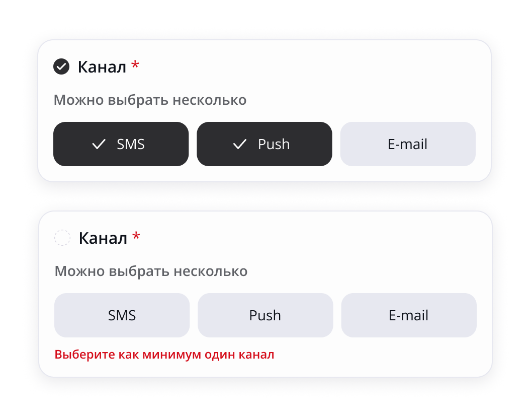
I added required-field indicators and validation errors for the prompt and channel fields.
The Generate button remains disabled until all required fields are complete. Clear guidance and validation help users understand what is missing, correct errors, and reach a successful result.
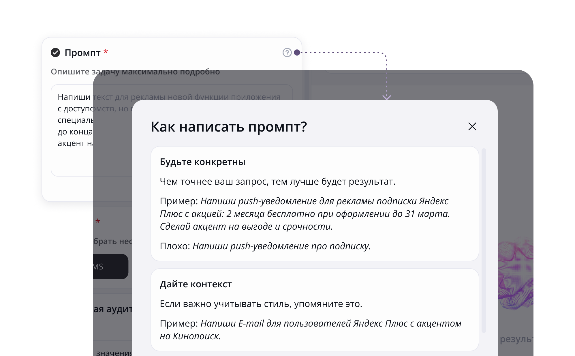
I added a question-mark icon that opens prompt-writing guidance. Not every professional copywriter is familiar with AI assistants, so some may need help creating an effective prompt.
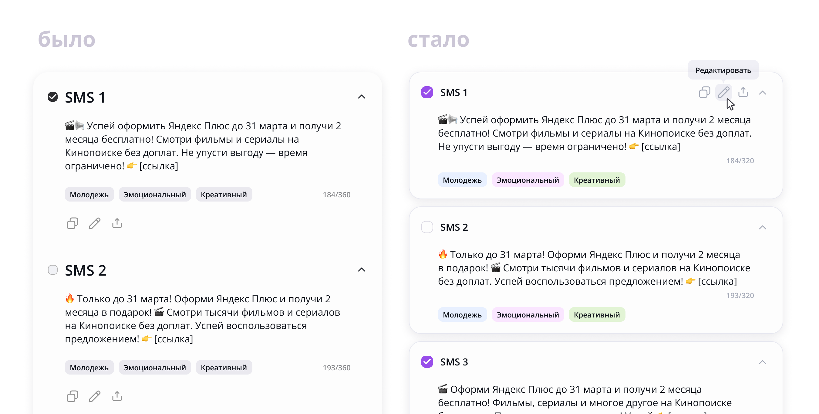
I placed model responses on separate surfaces to improve readability. Without clear separation, a long list of responses can become a wall of text and increase cognitive load.
I refined the visual hierarchy within the response cards. I made the checkboxes larger and easier to select, while reducing the response titles so they would not compete with the section heading.
I moved the response controls to the top and revealed them on hover, reducing visual noise from repeated elements.
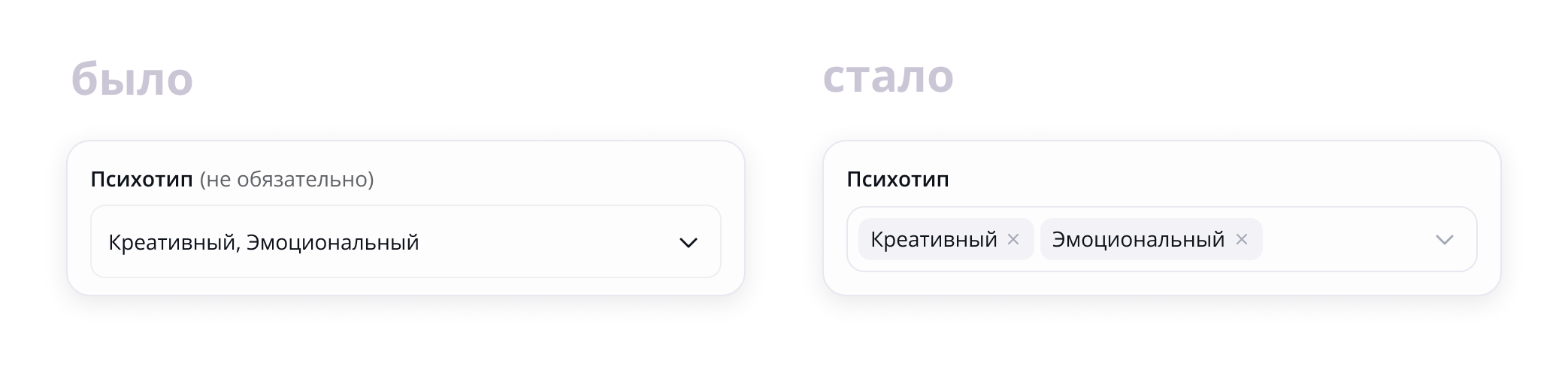
I displayed multi-select values as chips to make selected items easier to scan and remove with a single click.
I changed the new-chat icon. Participants in the hallway usability test did not immediately understand the pencil icon, while they recognized the plus icon straight away.
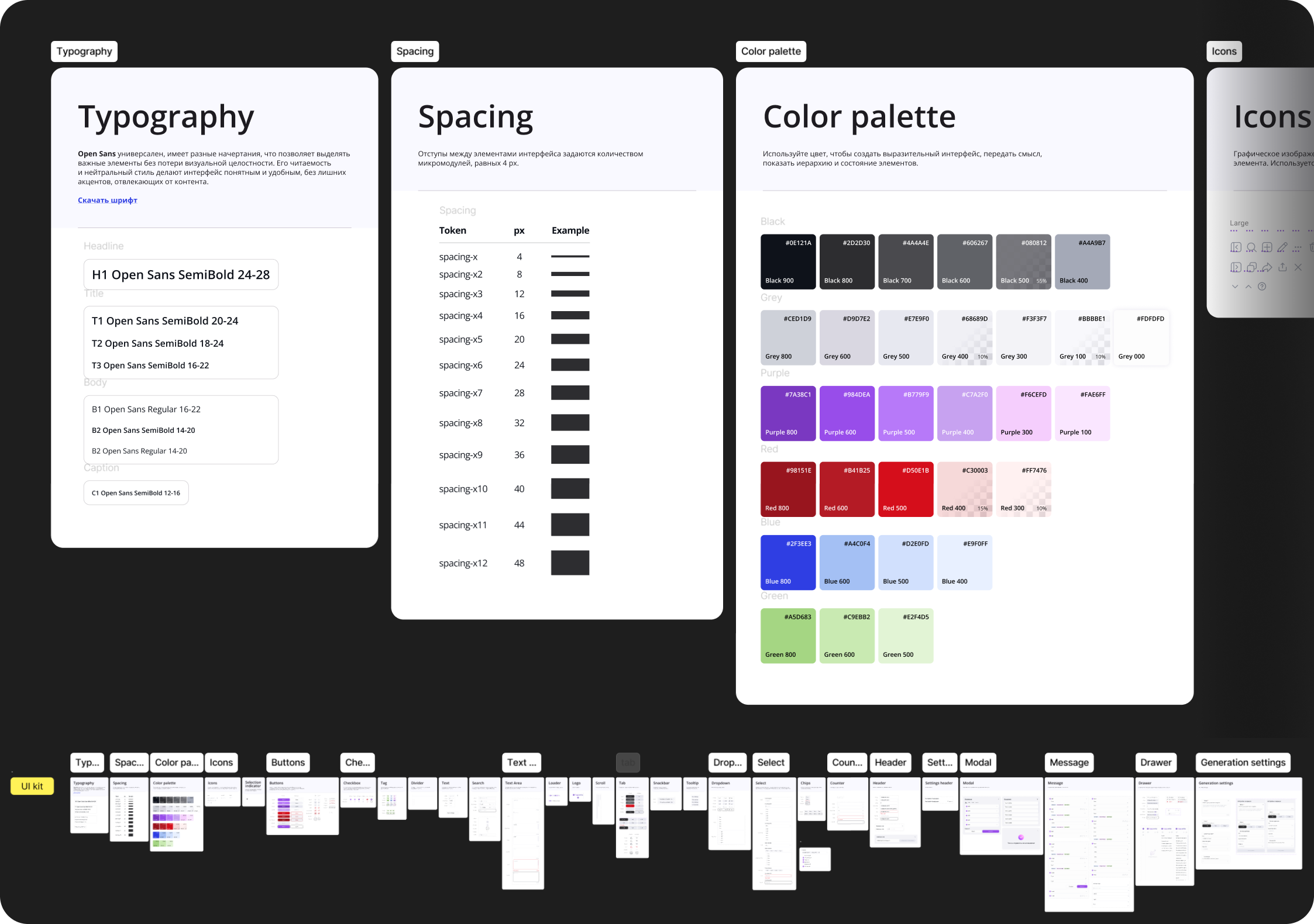
After the final revisions, I completed the visual design, defined the color palette, and assembled a UI kit. I also documented detailed flows for creating and finding chats and editing text, then presented the solution to the team.
Proposed metrics
Because the service was not launched, there is no actual product data. These are the metrics I would use to evaluate its effectiveness after launch.
Primary metric
Average time from creating a new request to selecting copy for approval.
It is directly tied to the product’s original goal: helping copywriters complete their work faster.
Supporting metrics
- Share of generations after which at least one variant is selected for further work.
- Average number of manual edits before approval.
- Share of texts sent to an editor within the service.
- Time required to find a previous generation.
- Share of repeat generations for the same task.
- CES for the copy-preparation flow.
Outcome
I designed two iterations of an AI service for copywriters and developed the flows for creating a request, generating and editing variants, searching the history, and sending selected copy for approval.
Hallway usability testing revealed issues with required fields, new-chat creation, and the presentation of generated results. Based on the feedback, I refined interface states, improved the response hierarchy, and made the primary actions clearer.
The final concept and UI kit were presented to the internship team.
What would I improve with more time and influence?
- Add prompt templates for different task types, so users would not have to formulate every request from scratch.
- Develop the approval flow with statuses and comments. It is currently represented by a single button, but could become a complete lightweight review workflow.
- Conduct research with the studio’s copywriters to validate the design decisions.